About this Site

Purpose of this Blog is to become a tool and a place where artist that collect and paint flat figures can find interesting links and news about flats, painting techniques, history and various related articles.English speaking related sites are very few but hopefully this blog will provide the collector and the painter with interesting and valuable information about the Art of the Flat Figure and everything related to it.
During the next days I will post any related info I have collected for a long time about various aspects of Flats. Techniques, photos, links, historic articles, anything that is related. Wherever possible I will including the author of the original article. I apologise if sometimes the author's name is not included. It's not intentional but it is lost through time.

Tuesday 3 July 2007

Chapter 6 - Enamles / Gouaches / Acrylics

By Panos Charalampakis


CHAPTER 6
Enamels / Gouaches / Acrylics


In this chapter will be discussed the methods of painting a flat figure using enamels, acrylics and gouaches. I must confess that I don’t have a lot of experience from these 3 mediums. So only a brief discussion will take place. For more information about each method I will point out the appropriate reading.
Starting with enamels, there are a lot of resemblances with oils but there is a big difference. While oils need hours or even days to cure so they are still workable, enamels have a much shorter drying time, making things a bit more difficult. When painting with enamels never use the paint straight from the little tin jar. Instead, take a small quantity of paint from the bottom of the jar to your palette and add 1-2 drops of thinner to make a workable mix. It is recommended to use the specific thinner each brand has for its colors. When the new mix is ready and homogenous apply one or two thin coats of the base coat to the figure and let it thoroughly dry. Next day, prepare a shadow mix from the base coat plus the darker tones appropriate from each color. Its very important to make this mixture very diluted and apply it in all the areas that will be in shadow, folds, creases and so on. If paint is not diluted enough you will end up painting dark brash strokes which is not what we are after. Dip the tip of the brush into white spirit and whip it of onto a tissue paper and blend the edges of the shadow color and base coat to get a smooth transition between colors. You may need to do this step more than once, in small increments so you get the shadow color gradually. When this is dried make a light mixture from the base color plus some lighter tones appropriate for each color you paint and apply them thinned onto the areas that will be highlighted. Do the above technique to smooth the borders of the base color and the highlights. Now the figure has its base color, shadow and high lights applied. You may need to repeat the shadow and highlight steps for more contrast between shadows and lights. Don’t underestimate any painting medium. Many people think that oils is the only paint that should be used if an artistic result is what is after. This not true. Bill Horan, Mike Blank or Dough Cohen use enamels exclusively on their round figures with spectacular results. For specific techniques about enamels I strongly recommend Bill Horan’s or Mike Blank’s books. See Appendix 2.


Gouache is the next examined color of this chapter. It’s a not very known painting medium used mainly by the advertisement business. I have never used it, nor I have seen how it looks like at the shops. I have seen painted examples of flat figures though, that are really amazing at the same level with figures painted with oils or other mediums. For this I will include a very informative article written by a member of British Flat Figure Society, Simon Hoggett, of which I am a member also.


“Painting Flat Figures in Gouache by Simon Hoggett.”

It is generally accepted that you paint flat figures in oil paints. Well, that’s all very well but what happens if you can’t paint with oils to save your life? This article will look at one possible alternative that you might not have considered – Designers Gouache Oil paint! I never could get to grips with the horrible stuff, despite studying art to A level standard at school and later doing graphic design at university. Whatever it was that you needed to be able to achieve success with the medium, I just didn’t have it! Perhaps it was my lack of patience. Maybe it was the fact that I never knew when to stop fiddling, until the whole lot blended into a uniform brown colour. Of course, if I’d restricted myself to painting figures of female mud wrestlers I could have been a master of the genre. As it was, my efforts looked simply awful. So, the oil paints went in the dustbin, taking a well-deserved place next to the empty tins of cat food and baked beans. I had to find something else. To be honest, when I started modelling it didn’t matter much. I was building Historex kits straight out of the packet, armed only with a blunt craft knife and a tube of glue. Not for me the finely customised masterpieces of Bill Ottinger or Shep Paine. Most of mine looked like extras in Dawn of the Dead. As for painting, a quick coat of Humbrol usually did the trick, plus a few rash experiments with acrylics with invariably bad results. The family yawned with indifference which I happily mistook for stunned admiration. Ah, those were the days! But then I discovered flat figures, or re-discovered them really because I had a small collection from my childhood. At that time, my aunt, who was quite a catch on account of the fact that she ran a pub, was energetically courted by the dubious owner of the local militaria shop. As part of his valiant campaign to win her hand in marriage he showered her favourite nephew (me, of course) with gifts of flat soldiers and military books. Unfortunately, she dumped him in favour of her life-long love affair with gin and cigarettes. He sold up and disappeared without trace, broken hearted but no doubt consoled by a fair chunk of her savings.


Above:
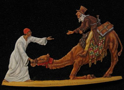
French Line Chasseurs from Glorious Empires painted in gouache by Simmon Hoggett.


But I digress. In the early 1990s I began to see beautifully flat figures in the magazines and shows and I was instantly hooked. Flats are like that. It’s an instant thing. You either love them or hate them. I loved them. The childhood figures, with bent weapons and broken limbs, injuries sustained in a disastrous skirmish with Action Man in the early 1960s, were marched out from the dark recesses of the attic and became the basis for a new collection. New purchases were added and I started to face the
problem of how to paint them. It’s the painting that makes flats come alive and Humbol just doesn’t cut it for me. It’s too flat, especially on horses. I tried again with acrylics but that didn’t work for me either, especially as I failed to screw the tops on the tubes properly and they all went rock-hard overnight. My options
were disappearing fast.
Then I remembered Designers Gouache. (Remember, this is an article about gouache!) I had used this regularly whilst at college and for a short while afterwards when working in design studios. This was in the days before computers and all design and artwork had to be done by hand. Whilst rubbing down the Letreset and inhaling Cow Gum fumes I had
gained a reasonable competence with the stuff.
It’s a water-based paint, but more opaque than standard watercolours. Lots of watercolour painters use it, especially White, to beef up their paints and add highlights. Hence, a traditional name for gouache is ‘body colour’. You can find them in all good art shops and most of the bad ones as well. They come in tubes which cost an arm and a leg, but they are a lot cheaper than oil paints. The two main manufacturers are Winsor & Newton and Daler Rowney. Although, there isn’t a huge amount to choose between them, I happen to prefer the Winsor & Newton. I find that there’s something odd about the consistency of some of the Daler Rowney colours, although that could be my imagination. But I don’t like the horrible stripy design on the tubes anyway.
I tend to use a fairly small palette, mainly because I’m a cheapskate, but you do have to watch the transparency and permanence of some of the more obscure colours. Check the label codes closely before splashing out a few quid on some beautiful shade of red that will vanish faster than the pies at the weight-watchers Christmas party.
There are several blacks and whites available but personally I prefer Ivory Black and Zinc White because they are most versatile. Avoid Lamp Black like the plague because it is far too ‘sooty’. The other colours I use are: Burnt Umber, Burnt Sienna, Yellow Ochre, Prussian Blue, Ultramarine Blue, Cadmium Yellow Pale, Spectrum Red, Scarlet Lake, Red Ochre and Paynes Grey. I also use a tube of watercolour called Neutral Tint which is really useful for shading white.


Above: French Line Lancers by Thiel painted in designers gouache by Simon Hoggett.


You will notice that the names of the colours are the same as oils. This means that you can take advantage of all the wonderful colour mix recommendations you find in this magazine. In fact, my colour mixing bible isn’t for gouache painters at all. It is the “Oil Painter’s Pocket Palette” by Rosalind Cuthbert. If you haven’t got a copy of this, I advise you to rush out and bag one right now.
This is not an article on how to paint flats. This isn’t the place for learned thoughts about chiaroscuro, directional and reflected light sources, trompe l’oeil effects etc. I will leave that to other more skilled exponents. But I thought I’d share some of my experiences with gouache. A few slightly different techniques are needed to gain a level of success. As with all flats, the first thing to do is get rid of all the flash on the shiny metal figure and cut off any extra limbs on ‘combination figures’. Some flats have more arms than a Hindu god, which allows you to create several different figures from the same master. Pure genius isn’t it? The cleaning up should be done with a sharp knife and some mouse-tail files. I would also advise having a damp cloth and a glass of brandy close by. The cloth is for wiping up the blood when you plunge the knife in your hand and the brandy is, of course, for purely medicinal purposes. Many flats painters will tell you not to worry unduly about minor pitting in the surface of the figure because the paint will fill it. Well, oil paint might but gouache won’t, so you need to make sure they’re filled. The figure then needs undercoating. There are several options here. You can spray it with Car Primer but if you don’t shake the can well, it comes out like all blotchy like fake snow. This is not an ideal starting point, so shake it until your arm drops off and you have a migraine from listening to the ball-bearing rattling around inside. I recommend that you spray the figure outside in the garden and particularly suggest that you void using it on the dining room table because the paint is a devil to get off the polished wood and all the inhaled fumes make you fall over a lot. Not that I’ve tried this, you understand. Honest!
Some people undercoat with Skull White paint from Citadel Miniatures. If you’ve got any left over from painting your skeleton army then use that, but otherwise I would recommend Humbrol Matt White enamel, which you should thin down so it doesn’t clog up the fine detail on the figure. Many people use two coats of this, allowing it to dry between coats. They say they like the pure white base to work on. I personally only use one coat and work on a figure that is dull and grey to match my winning personality.


Above:
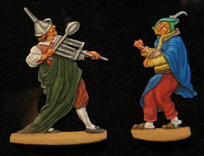
Medieval peasants by Golberg painted by Simon Hoggett


The real problem with gouache is getting it to key to the figure at all. If there is any grease on it at all, then you haven’t got a hope in hell. Even the slightest fingerprint will give you serious problems. So the first thing to do is to de-grease it. To do this, I dip the whole figure in a vinegar bath. There’s nothing special about the vinegar – I use the regular brown stuff that I put on my fish ‘n’ chips. I know it sounds bizarre, but it works. I then attach the figure to an old poster paint jar which I use as a holder, without ever touching it with my fingers, and allow it to dry off. I am now ready to paint.
Getting the consistency of the paint right is important. You mix in the water until you’ve got something that approaches the consistency of single cream. This will be fine for blocking in colours. For the intricate bits you might want it to be a bit thicker, which will allow you to put in fine detail such as braiding and buttons. Because gouache dries quickly, you can add detail in light colours such as white and yellow straight on to dark colours like Black and Prussian Blue only minutes after you have painted it. That means that you can paint a complete figure at one sitting if you’ve got nothing better to do for nine or ten hours. No more waiting for stuff to dry. On the other hand you can return to a delicate blending job weeks after you’ve put the initial colours in place.
Gouache dries to a slightly different shade than when it’s wet, so you need to compensate for this. Come to think of it, do all paints do that? I’m not sure. Answers on a postcard, please. Anyway, I don’t even think about it. It just seems to work. However, you do have to watch it when you’re shading and highlighting, because what looks like a slightly lighter mix of your base colour can look much lighter when it’s dry.
Shading takes some practice but is very achievable. This is how I do it. I lay down the base colour first and then create a slightly darker mix to block in the shadows. To get rid of the hard edge between the shades, I then take a damp brush (not wet, or you’ll take the paint off, which is not quite a disaster but comes pretty close) and feather the edge, blending the darker shade into the base colour. Having done this I mix another darker shade and repeat the process until I am happy that I have the ‘depth’ I need. The more steps you take the better the result. I tend to go for about three or four. I then use the same process for the highlights, blending the edges of progressively lighter mixes of the base colour until I’m satisfied - or bored.
A flat-collecting colleague recently said “but surely they aren’t waterproof?” Well, true, but this hasn’t been a problem since I stop playing with them in the shower! Seriously though, most collectors mount their figures in frames or box dioramas, or display them in cabinets. So, I don’t think that their failings in the waterproof department is really a problem. Okay, they won’t take rough handling but who’s going to do that anyway? If you really must, you can protect the painted figures by spraying them with a matt varnish. This works well, but it does change some of the colours slightly, which can be pretty irritating so I recommend that you do some tests first. I’m not claiming the gouache is the best paint to use on flats. If you’re getting good results already, then fine. However, if you struggle with oil paints, why not give it a try. It does work. Well, you can judge for yourselves, from the pictures with this article. Okay, so I’m no Michael Taylor or Ken Pipe but I have achieved a standard that I’m happy with."


Acrylics is another option someone has to consider. They have become a trend lately by the Spanish school of artists and many people use them exclusively for their work. When you get the feel of it, it can become a tremendously artistic medium producing amazing results. Since I never seriously used them in any other way other than undercoating (although I tried a couple of times), I will include an excellent article of Mario Fuentes in this chapter explaining how you can get amazing results using this type of painting medium. Although the article is written with round figures as examples, same techniques apply to our flat figures with minor modifications due to scale or the obvious difference of three dimensionality.


Above:
Napoleonic Officers. 54 mm flat figures from Glorious Empires painted in acrylics.

Chapter 5 - General Thoughts about Painting

By Panos Charalampakis


CHAPTER 5
General Thoughts about Painting


Finally the time for real fun is about to begin. A paint job can make a mediocre figure stand out or an excellent figure look like a cartoon. Key points for a successful painting job are:

  • Quality of the paints and brushes used.
  • Constant direction and quality of the light source.
  • Some planning of the painting patterns from the beginning.
  • A simple knowledge of colors and basic color combinations.
  • Understanding simple concepts such as light and shadow, or shape and form.
  • Careful and slow, without rush, painting.

Some general thoughts about painting are required before dive deeper into the certain materials and techniques. For many people, including me, painting is a mental process. Forms, shapes, light and shadow, all are there in the depths of our mind even without consciously knowing it. When we see a painting or a painted figure our mind uses this information to process the image and the result will be to like or not what we see. For flat figures particularly, some people enjoy to see just some colors on them, others to see the exact colors that they think they are correct for the particular figure while still others prefer to see a highly detailed painting job until the last small shadow and highlight on a 30mm pommel of a sword. I have heard a saying states that if we give a figure to 1000 painters we will see 1000 different painted figures. And that’s so true. Each of us has his/her own likes and dislikes, preferences and notions of what is visually nice or correct and what’s not. What is best for sure when we start a new figure is to try to do our best for it and to paint and finish it as good as we can. The goal is to achieve a personal satisfaction when finish it. If we are satisfied by the end result then we succeeded on what we did, no matter what other people say. Of course it’s very useful to listen to other people comments, especially the “master” ones, and try to use their comment, knowledge and tips for improving our work. But then again, if we like our newly finished figure then we achieved our goal. Always try to add a bit more to the next figure. Adding a bit more to every figure we paint will eventually takes us to a master level, without effort and without even consciously knowing it.


Above:
An interesting example of how two painters produce two results. Figure is called “Dance” and is 120mm from Detlef Belaschk. On the top painted by Amalia Retuerto. Below artist is unknown
.


I said in the chapter discussing materials that I would talk about paints and brushes in this chapter. So let’s start with brushes. A ubiquitous truth is ALWAYS buy the best brushes you can afford. These small weapons of ours, can make our life much better or much worse only by their quality. A good brush is the one that even after some use it retains its tip unharmed. When buying brushes check the tips thoroughly. Many good shops may let you dip the brush into a bowl of water to check if the tip is sharp after. I have tried many brands so far but Winsor and Newton Series 7 with natural hair is by far the best. Brushes come in 000, 00, 0, 1, 2 and so on. They also can have short or long hairs, can be pointed or flat, soft or tough, with synthetic or natural hairs. For painting flat figures it’s always good to have an assortment of the above types. Each of them can have its use. Bigger or smaller are useless for us. Another good brush is the Andrea 000, 00 and 0. They have few very pointed hairs that makes it ideal for outlining, drawing very thin lines or adding dots for eyes, buttons etc. Always try to use the biggest brush possible for each surface you paint. That produces a more even finish with less brush strokes visible.
A very important factor for a brush’s life besides the way we use it, it’s the way we clean it. Thorough cleaning with the respective cleaner, like for example good turpentine for enamels or oils and alcohol or distilled water for acrylics or water based colors. Always wipe the brush with gentle movements from the handle towards the tip of the brush. Always store upright with their protective cap tagged.
A last word of caution before we proceed to paints. Try to keep a separate set of brushes for acrylics and for oils or enamels. Mixing the painting mediums for brushes leads to their fast destruction and should be avoided.
The golden rule of always buying the best possible applies for paints too. I have some tubes of oils paint more than 10 years and with proper care and storage they are like new, with less than half of their quantity spent. Winsor & Newton, artist series is the best you can buy with Van Gough, Talents, Maimeri and Rowney and Georgian following. Personally I keep a selection of W&N plus some additions from certain brands. Humbrol is the king of enamels which by the way have a very nice and useful series of metallic paints, the metalcote series. Andrea and Vallejo are the main acrylic colors but I can’t say a lot about them because I don’t use acrylics besides using them as undercoats. A very important parameter in our painting of flats is the light. I mentioned earlier about the color temperature different kinds of light bulbs have at the chapter about material. Here I will discuss about the direction of light. Why the direction of light is so important for us? Because on the contrary with the traditional round figures, we have to produce the illusion of three dimensionality by our careful placing of highlights and shadows onto our figure. Put an unpainted figure below a light source that is coming from directly above. Observe the shadows that produced onto our figure.


Left: Napoleon Bonaparte at the Egyptian campaign. A spectacular example of overhead lighting painted by Greg Di Franco.


Then place the light source on the above left and then on the above right sides of the figure. Observe again how these shadows change with the change of the light direction. If you do the same with a painted figure, assuming that this was painted with a constant light direction you will see the figure changes drastically in each case. Now you understand why the constant light direction is so important. Above left, above right or directly above is a matter or personal preference. A trick that can help a beginner produce a good result is to place it towards the face of the figure. Shadows and lights will be easier to form. Later you can experiment with other configurations for some spectacular results.
Careful planning of the color patterns from the time we start to work with the figure is imperative. That is especially true for military figures for which there are certain colors and hues that we have to consider for clothing and equipment. References along with some common sense will do the trick here. For example we can’t paint a tunic of a Knight of the St John order at the crusades red. This is simply wrong. Reference will dictate a black tunic. Common sense and a little clever thinking will dictate that the tunic wont be a rich, pure black but will be somewhat faded from the worn and the sun during the campaign. Maybe if we add some dirt on it will look even better. Planning this from the beginning will help us envision the end result so we know what we aim for and what other colors can be used that are correct for the particular figure but pleasing to the eye too. Civilian themes gives much more freedom but again some common sense is needed. Painting a sword of a medieval peasant foot soldier with rich golden embroideries can be pleasing to the eye but on the sphere of science fiction since the poor fellow couldn’t’ even afford to dream such an expensive weapon.
A simple knowledge of colors and color combination is also imperative. I will discuss specific colors later in other chapters. Now is enough to say that when planning on the color patterns, always take into consideration that each color has various hues, can be deep or light, can have a warm or cold color temperature and that maybe a color A will look better and will be more eye pleasing next to color B than to a color C. Also, by using the so called complementary colors can produce various effects. Complementary colors are colors that are opposite each other on the color wheel, such as blue and orange, red and green, purple and yellow. These colors, when used side-by-side, make each other appear brighter. When they are mixed, they neutralize each other. How you know all this? Basically by experience that comes from careful observation of everything that surround us and from years of painting. Of course, there are dedicated books or internet web sites for someone that wants to study colors and their properties. I would suggest at least for once to read such a book or web site. I am sure that there will be many things to gain and nothing to loose.
The most crucial factor in flat figure painting is understanding of the concept of shadows and highlights. If someone understands and learn how to use shadows and highlights onto his/her figures then he/she can paint anything, no matter how difficult the painting scheme is. The three dimensionality onto a flat figure can be achieved only by careful placement of the shadows and lights with the appropriate color tones. Shapes will be formed out of nowhere. Body parts will be enhanced, clothing, equipment and other objects will take a geometric form otherwise impossible to visualize. A head wearing a helmet is nearly flat onto our figure. When painted correctly, the viewer will be tricked to think that the head is actually close to spherical and the helmet on it follows the same shape. How we actually create shadow and lights by colors though? Easy. Let us prepare 3 different color solutions. Solution A will be called light, solution B will be called base and solution C will be called shadow. And let us envision a flat figure wearing a shirt. Paint the whole shirt with the base solution. Then careful add the shadow solution to all surfaces that are away from the light source, in all creases and folds and around any belt or other item in contact with the shirt. Blend these two solutions so there is no abrupt stop from one to another. Take your time when blending colors. With a dry brush with soft hairs unite the two colors and don’t leave visible strokes. Then paint all the areas closer to the light source and all the raised areas and top of folds. Blend careful again and be careful not to extend this solution to the places where the shadow solution was painted. By now you have created you basic shirt color with basic shadows and lights. If you darker the shadow solution and lighter the light solution you have 2 new solutions for deep shadows and high lights. You can keep doing this procedure until you are completely satisfied with the end result. By now the shirt of the figure looks three dimensional already. By careful blending of the solutions you can make things appear whatever shape you want. Study the next figures and observe how form is achieved simply by adding shadows and lights one next to the other.


Fig 1. A real sphere. Observe how it gets darker and darker as we move from the light source (left side) towards shadow (right side)


Fig 2. Light (white) and Shadow (black) solutions are added


Fig 3. Base solution of the intermediate colors is added (grey).


Fig 4. Now the 3 colors are blended. No one can say that this object is not a three dimensional sphere.


Fig 1. Actual box


Fig 2. Base, light and shadow mixtures have been added. Shape is starting to be formed


Fig 3. The finished result after blending.


Fig 1 A Cylinder.


Fig 2. The 3 mixtures added.


Fig 3. The finished shape of a painted three dimensional cylinder.


On the above 2 figures observed how hard edges between shades can produce another geometrical pattern of a polygon instead of a cylinder and how the soft edges from blending can transform the polygon into a cylinder.


Fig 1. A cone. Remember always to identify the light source direction. This case is upper left which is the most usual direction flat painters use.


Fig 2. Base color, lights and shadow added.


Fig 3. Complete Cone after blending. Observe how smooth transition produces the curved side of the cone.


Fig 1. A ring


Fig 2. The three basic mixtures added.


Fig 3. Our painted ring complete. Who can say it’s flat and not 3-dimentional?


A final touch when shadowing and highlighting our figures is to add a crescent of light color onto the most shadowed parts of our painting. This is called reflective light and adds to the 3 dimensionality of the figure. Study the above figure of the ring.
Now apply all these basic concepts to a painted flat and see how it is onto the actual figure. Study how light and shadows have produced a three dimensional white tunic on the native Egyptian or the camel lost its flat shape and got curves from musculature.


Above:
Figure from Mohr’s 30mm set of Napoleon at the Pyramids depicting French chemist Claude Louis Berthollet painted by the author.


Another trick that many painters use is the painting of a cast shadow. This is the shadow that is produce from an object that gets in the way of the light source. For example a sword hanging from the side of a figure casts a straight shadow onto the trousers. Many times during painting we use two certain techniques people call dry-brushing and wash. They mainly come from armor modeling but can be of some value to flat figure painting. For the first technique we take some color with our brush, wipe it almost clean onto a tissue paper and we brush a surface lightly so any raised detail will be softly painted. In this way we can produce some grainy textures or make some raised details stand out. Remember to wipe the brush of almost all of the paint otherwise a brush stroke will be visible onto our figure. Always test it onto the paper before you touch the figure itself. Wash is a kind of reverse technique. When we want to define some shadows more we can use a wash of the shadow mix at the crevices and folds of our figure by using a very diluted mixture of our shadow solution thinned with thinner to high ratios of 1:8 and above. Its better to be more diluted and to repeat the process a couple of times than to actually put a splash of the shadow color if its not thinned enough. Again test it onto tissue paper before touch the figure. Although these two techniques sound easy and promising, not many painters use them on flat figures but they prefer to produce similar results with actual painting and blending.


Left: Another figure from Mohr’s 30mm set Napoleon at the Pyramids of a soldier clearly shows us the effect of the cast shadow of the weapon onto the body of the soldier, painted by the author.


Left: A scene from Carl Spitzweg geniously painted by Kevin Dunne showing the use of shadowing and highlight in achieving geometrical patterns out of nowhere, like the small table or the glass sphere.


A specific technique that uses wash and it can be really helpful for us, produsing some spectacular results is glazing. This is simple a highly diluted wash of a certain color that can change the overall appearance. For example if we paint a white tunic and we want to give it a colder appearance we can use a glaze of very thinned blue color. This way white will acquire a cold blue cast but still will be white to our eyes. It may be needed more than one washes but again its better to do it in steps than to actually make our nicely highlighted and shaded white tunic a blue tunic.


Above:
Figures from Mohr’s 30mm set title “Das Bohnefeast” painted by the author. Observe how lights and shadows produce shapes and three dimensional feeling even in such tiny surfaces. Remember that a face is half the size of a head of a matchstick in this scale.

The next two chapters will present various painting mediums along with some photos with figures painted with each specific medium. What anyone chooses is his or her own choice as long as he/she feels comfortable working with it. What must be remembered is that by observing other people’s work or reading about it and then assimilate it into our own style is the key for a successful, enjoyable painting.


Chapter 4 - Preparation

By Panos Charalampakis


CHAPTER 4
Preparation


Above:
The Medieval Dentist by Eric Talmart.

This is the first stage of working with any kind of model or figure. For us, prepare our flat figure for painting is a really simple and fast process. Always start by spending some time observing and studying the figure. Look at it from every direction, turn it upside down or observe it with different light direction. Make a mental note of what have to be done to clean it, where attention must be paid or even start mentally putting some preliminary colors. Having a good feeling of the figure and a plan of actions to be made can pay off eventually by avoiding mistakes, unfortunate accidents of removing that annoying piece of protruding metal that later was discovered to be the pommel of the sword and even save time from correcting mistakes later, if they are correctable of course…
After we are aware of what is what onto our small person, we start by cleaning the flash metal residues from the figure’s edge. Do this with gentle, controlled movements, always perpendicular to the edge by sliding the blade up or down. Start from a point and don’t stop until you do a complete circle of cleaning and be at the starting point again. Use fresh blades and discard them as soon as you feel they are not sharp enough. Pay extreme attention to small details, like weapons, sticks, noses, hair tufts, clothing or hat detail, anything that protrudes from the general shape, first not to remove it surgically and secondly to define all these edges. The more sharp and defined detail is, the better will get the paint and will be defined and visible in the finished figure. Special if not equal attention must be paid to the small metal base that the figure is standing upon. Never remove front or back of it for 2 simple reasons. If we observe it closely we will see some odd numbers and letters on it. They are not there accidental. These are the signatures of the designer, engraver or editor that allows us to accurately identify each flat figure. Another more practical reason is that if the figure is displayed upon some background framed, the back edge can be inserted into the background of the frame securing the figure with minimum glue needed. I am sure that all of us have cut these bases of our firsts figures thinking it was an unnecessary burden. I have done it. Next step is the bathing step. Quite a fun step actually. When figure is cleaned it needs a bath with a solution of warm water and vinegar, the plain, cooking form, usually overnight. This is needed mainly with old casts that contain high amount of zinc to prevent oxidation and clean all kind of oily residues from casting or from our fingers during cleaning stage. The next day, rinse with plenty of water and brush the figure with an old used toothbrush and set it aside standing straight. From this points touching the figure is not allowed anymore because the oil of the skin will react with the paints later and problems may arise. When figure is dried, it can be attached temporarily using some blue tack (material which is used to stick posters onto walls), either onto a simple base for holding it or onto a cardboard. Just a small note for each situation. If you choose the small base option, go for one that is easily and comfortably held into the palm so the figure can be manipulated easily, precisely and for long time without tiring and making the handle tremble. If you choose the cardboard option , choose a rather hard one, a bit oversized so it can protect the edges of the figure. You may want also to paint it a dark, neutral color to allow contrast with the figure. Personally I paint it either black because I like the contrast of black with my colors and also because most of my flats are displayed against a black velvet background or the same color as my final framed background so I can have a better feeling for the end visual result. Preparation stage is nearly finished except the last final step of priming. Even the slowest working people finish this rather boring but very important stage in less than 1 hour (if you don’t count the bath time of course) and proceed to primering of their figure.


Above:
On the left figure is primed and ready for painting. On the right figure is right after bath. Both figures from Moh’s set of “Funeral of Gustavus Adolfus”.

The reason for primer a figure is to seal metal and to make a friendly surface for the paints for good covering by the different layers on the figure. Primer acts as a grip for paints, not only allowing good and even coverage but also, when painting in oils, absorbs some of the oil component of the paint, making painted surfaces more mat than usual. I almost exclusively prefer to use white color as a primer but I know of other people who prefer gray or even black. I guess it’s a matter of personal preference. All is needed is a couple of very thinned white paint coats, evenly and smoothly painted onto the figure allowing at least a day between coats so each coat is completely dried before the next is added. Spray cans, humbrol enamels, acrylics, or airbrushing, all have been used by various people. I prefer the old trusted humbrol enamel white, thinned to a ratio of 1:3 with thinner brushed evenly onto the figure. If you choose spray cans be careful not to clog the smallest details with more than enough paint. Acrylics can be used also but I feel they neither grip the metal surface nor the following oil layers strong enough.


Above:

Unidentified figure and artist, exceptionally painted. Observe how the careful placement of shadows and highlights make the figure three dimensional.

Chapter 3 -Materials

By Panos Charalampakis

CHAPTER 3
Materials


Comparing the expenses someone might have when painting flat figures with other aspects of modeling, not to say other hobbies, we are the lucky ones. Very few tools and materials are needed and used even by the professionals. Of course someone can invest in more exotic materials but then, it’s a matter of personal taste and preference. As an old Greek saying states “tools don’t make you an artisan, skill is”. What is important, is to realize that even with 2-3 good brushes, half a dozen of paints, 1-2 files and a scalpel, everything is possible. For descriptive reasons I will present more materials but always have the above statement in the back of your mind.


Above:
Author’s workspace.


Let’s start from the very basics. Our workspace. All some people need is a steady table, a simple light and a comfortable chair. Others, for various reasons, paint onto the kitchen table along with our beloved other halves. The luckiest have a dedicated room or at least a big portion of a room all for them. Whatever the case might be, go for a steady, large enough table, 1 or 2 good light bulbs and a comfortable chair.

Let there be light. Light is one important aspect in all kids of modeling but it becomes so important for flat figure painting, that a wrong light, or a constantly altering light source can destroy days of painting. Daylight, but not direct sun light is a blessing but since most of us have a real life other than figures, most of the painting will take place during the night. Day light bulbs are a good option in this case. It is important to remember that normal incandescent bulbs have a yellowish-orange hue, fluorescent lamps are closer to green spectrum while iridescent ones tends towards purple or blue. We can always compensate with our painting but its better to solve this problem from the beginning. Also stick to the same kind of light and from the same direction (see also painting chapter) from the start to the finish of a figure or a group of figures if they are destined to be displayed together.
In some point or another you will most probably need a kind of magnifier to add small details or simply to paint everything because age plays its role. Most of the painters are using an optivisor, a kind of magnifier that you can wear it much like a hat. It has 2 advantages. It let you hands free giving freedom of movement during painting and gives good laughs for the family when they look at you. You can of course use any kind of magnifying device as long as you feel comfortable with it.
Moving to tools, a scalpel with changeable blades is maybe the single most important and very cheap tool someone can have. Due to profession I have used all kinds of blades, each of them have a number that denotes its shape and size. The most useful one is No 11, the one with a straight edge ending to a sharp tip. It’s an all purpose tool that besides the obvious use of cutting, it cleans flash from figure’s edge, or engraves some detail lost from the cleaning. Its use is limited only by lack of imagination.
Files are the next most useful, simple tool that we have in our disposal. Don’t be cheap when buying them. Choose the smallest, expensive ones that jewelers or watchmakers use. Buy 4-5 different shapes, triangular, round, flat and mouse tail. They won’t last forever but surely last long enough to worth the investment. Replace when they start clogging from metal residues. Remember that metal residues can be cleaned with an iron brush easily.
A small iron saw, precision tweezers, a pair of scissors, an iron ruler, pins and paper clips, a small hand drill or any other simple tool someone might think can be stored easily in case they are needed. Some form of strong glue like a cyanoacrylate type can be used for gluing parts, rarely, or attaching the figure to the base or frame.

Left: A selection of simple, cheap tools. These are more than enough for flat figures. Dremel power tool is a luxury but once you get it, you can’t live without it.


A personal favorite tool, although rather exotic for flat figures is a power mini drill. I had bough a really good one some years ago from Dremel and is so good and with so many accessories for sanding, cutting, engraving drilling and such which I’m sure it will accompany me till the end.
We will deal with brushes, airbrushes, paints and painting mediums at the appropriate chapter. All I can say here is DON’T be cheap with paints and brushes. ALWAYS buy the most expensive ones. Good paints and brushes can make our painting sessions a nightmare or the most enjoyable experience.


Above:
Serge Franzoi's Swedish Banner.