CHAPTER 5
General Thoughts about Painting
General Thoughts about Painting
Finally the time for real fun is about to begin. A paint job can make a mediocre figure stand out or an excellent figure look like a cartoon. Key points for a successful painting job are:
- Quality of the paints and brushes used.
- Constant direction and quality of the light source.
- Some planning of the painting patterns from the beginning.
- A simple knowledge of colors and basic color combinations.
- Understanding simple concepts such as light and shadow, or shape and form.
- Careful and slow, without rush, painting.
Some general thoughts about painting are required before dive deeper into the certain materials and techniques. For many people, including me, painting is a mental process. Forms, shapes, light and shadow, all are there in the depths of our mind even without consciously knowing it. When we see a painting or a painted figure our mind uses this information to process the image and the result will be to like or not what we see. For flat figures particularly, some people enjoy to see just some colors on them, others to see the exact colors that they think they are correct for the particular figure while still others prefer to see a highly detailed painting job until the last small shadow and highlight on a 30mm pommel of a sword. I have heard a saying states that if we give a figure to 1000 painters we will see 1000 different painted figures. And that’s so true. Each of us has his/her own likes and dislikes, preferences and notions of what is visually nice or correct and what’s not. What is best for sure when we start a new figure is to try to do our best for it and to paint and finish it as good as we can. The goal is to achieve a personal satisfaction when finish it. If we are satisfied by the end result then we succeeded on what we did, no matter what other people say. Of course it’s very useful to listen to other people comments, especially the “master” ones, and try to use their comment, knowledge and tips for improving our work. But then again, if we like our newly finished figure then we achieved our goal. Always try to add a bit more to the next figure. Adding a bit more to every figure we paint will eventually takes us to a master level, without effort and without even consciously knowing it.


Above:
An interesting example of how two painters produce two results. Figure is called “Dance” and is 120mm from Detlef Belaschk. On the top painted by Amalia Retuerto. Below artist is unknown.
An interesting example of how two painters produce two results. Figure is called “Dance” and is 120mm from Detlef Belaschk. On the top painted by Amalia Retuerto. Below artist is unknown.
I said in the chapter discussing materials that I would talk about paints and brushes in this chapter. So let’s start with brushes. A ubiquitous truth is ALWAYS buy the best brushes you can afford. These small weapons of ours, can make our life much better or much worse only by their quality. A good brush is the one that even after some use it retains its tip unharmed. When buying brushes check the tips thoroughly. Many good shops may let you dip the brush into a bowl of water to check if the tip is sharp after. I have tried many brands so far but Winsor and Newton Series 7 with natural hair is by far the best. Brushes come in 000, 00, 0, 1, 2 and so on. They also can have short or long hairs, can be pointed or flat, soft or tough, with synthetic or natural hairs. For painting flat figures it’s always good to have an assortment of the above types. Each of them can have its use. Bigger or smaller are useless for us. Another good brush is the Andrea 000, 00 and 0. They have few very pointed hairs that makes it ideal for outlining, drawing very thin lines or adding dots for eyes, buttons etc. Always try to use the biggest brush possible for each surface you paint. That produces a more even finish with less brush strokes visible.
A very important factor for a brush’s life besides the way we use it, it’s the way we clean it. Thorough cleaning with the respective cleaner, like for example good turpentine for enamels or oils and alcohol or distilled water for acrylics or water based colors. Always wipe the brush with gentle movements from the handle towards the tip of the brush. Always store upright with their protective cap tagged.
A last word of caution before we proceed to paints. Try to keep a separate set of brushes for acrylics and for oils or enamels. Mixing the painting mediums for brushes leads to their fast destruction and should be avoided.
The golden rule of always buying the best possible applies for paints too. I have some tubes of oils paint more than 10 years and with proper care and storage they are like new, with less than half of their quantity spent. Winsor & Newton, artist series is the best you can buy with Van Gough, Talents, Maimeri and Rowney and Georgian following. Personally I keep a selection of W&N plus some additions from certain brands. Humbrol is the king of enamels which by the way have a very nice and useful series of metallic paints, the metalcote series. Andrea and Vallejo are the main acrylic colors but I can’t say a lot about them because I don’t use acrylics besides using them as undercoats. A very important parameter in our painting of flats is the light. I mentioned earlier about the color temperature different kinds of light bulbs have at the chapter about material. Here I will discuss about the direction of light. Why the direction of light is so important for us? Because on the contrary with the traditional round figures, we have to produce the illusion of three dimensionality by our careful placing of highlights and shadows onto our figure. Put an unpainted figure below a light source that is coming from directly above. Observe the shadows that produced onto our figure.

Left: Napoleon Bonaparte at the Egyptian campaign. A spectacular example of overhead lighting painted by Greg Di Franco.
Then place the light source on the above left and then on the above right sides of the figure. Observe again how these shadows change with the change of the light direction. If you do the same with a painted figure, assuming that this was painted with a constant light direction you will see the figure changes drastically in each case. Now you understand why the constant light direction is so important. Above left, above right or directly above is a matter or personal preference. A trick that can help a beginner produce a good result is to place it towards the face of the figure. Shadows and lights will be easier to form. Later you can experiment with other configurations for some spectacular results.
Careful planning of the color patterns from the time we start to work with the figure is imperative. That is especially true for military figures for which there are certain colors and hues that we have to consider for clothing and equipment. References along with some common sense will do the trick here. For example we can’t paint a tunic of a Knight of the St John order at the crusades red. This is simply wrong. Reference will dictate a black tunic. Common sense and a little clever thinking will dictate that the tunic wont be a rich, pure black but will be somewhat faded from the worn and the sun during the campaign. Maybe if we add some dirt on it will look even better. Planning this from the beginning will help us envision the end result so we know what we aim for and what other colors can be used that are correct for the particular figure but pleasing to the eye too. Civilian themes gives much more freedom but again some common sense is needed. Painting a sword of a medieval peasant foot soldier with rich golden embroideries can be pleasing to the eye but on the sphere of science fiction since the poor fellow couldn’t’ even afford to dream such an expensive weapon.
A simple knowledge of colors and color combination is also imperative. I will discuss specific colors later in other chapters. Now is enough to say that when planning on the color patterns, always take into consideration that each color has various hues, can be deep or light, can have a warm or cold color temperature and that maybe a color A will look better and will be more eye pleasing next to color B than to a color C. Also, by using the so called complementary colors can produce various effects. Complementary colors are colors that are opposite each other on the color wheel, such as blue and orange, red and green, purple and yellow. These colors, when used side-by-side, make each other appear brighter. When they are mixed, they neutralize each other. How you know all this? Basically by experience that comes from careful observation of everything that surround us and from years of painting. Of course, there are dedicated books or internet web sites for someone that wants to study colors and their properties. I would suggest at least for once to read such a book or web site. I am sure that there will be many things to gain and nothing to loose.
The most crucial factor in flat figure painting is understanding of the concept of shadows and highlights. If someone understands and learn how to use shadows and highlights onto his/her figures then he/she can paint anything, no matter how difficult the painting scheme is. The three dimensionality onto a flat figure can be achieved only by careful placement of the shadows and lights with the appropriate color tones. Shapes will be formed out of nowhere. Body parts will be enhanced, clothing, equipment and other objects will take a geometric form otherwise impossible to visualize. A head wearing a helmet is nearly flat onto our figure. When painted correctly, the viewer will be tricked to think that the head is actually close to spherical and the helmet on it follows the same shape. How we actually create shadow and lights by colors though? Easy. Let us prepare 3 different color solutions. Solution A will be called light, solution B will be called base and solution C will be called shadow. And let us envision a flat figure wearing a shirt. Paint the whole shirt with the base solution. Then careful add the shadow solution to all surfaces that are away from the light source, in all creases and folds and around any belt or other item in contact with the shirt. Blend these two solutions so there is no abrupt stop from one to another. Take your time when blending colors. With a dry brush with soft hairs unite the two colors and don’t leave visible strokes. Then paint all the areas closer to the light source and all the raised areas and top of folds. Blend careful again and be careful not to extend this solution to the places where the shadow solution was painted. By now you have created you basic shirt color with basic shadows and lights. If you darker the shadow solution and lighter the light solution you have 2 new solutions for deep shadows and high lights. You can keep doing this procedure until you are completely satisfied with the end result. By now the shirt of the figure looks three dimensional already. By careful blending of the solutions you can make things appear whatever shape you want. Study the next figures and observe how form is achieved simply by adding shadows and lights one next to the other.

Fig 1. A real sphere. Observe how it gets darker and darker as we move from the light source (left side) towards shadow (right side)

Fig 2. Light (white) and Shadow (black) solutions are added
 Fig 3. Base solution of the intermediate colors is added (grey).
 Fig 4. Now the 3 colors are blended. No one can say that this object is not a three dimensional sphere.
Fig 1. Actual box

Fig 2. Base, light and shadow mixtures have been added. Shape is starting to be formed
 Fig 3. The finished result after blending.
Fig 1 A Cylinder.
 Fig 2. The 3 mixtures added.
 Fig 3. The finished shape of a painted three dimensional cylinder.
On the above 2 figures observed how hard edges between shades can produce another geometrical pattern of a polygon instead of a cylinder and how the soft edges from blending can transform the polygon into a cylinder.
 Fig 1. A cone. Remember always to identify the light source direction. This case is upper left which is the most usual direction flat painters use.
 Fig 2. Base color, lights and shadow added.
 Fig 3. Complete Cone after blending. Observe how smooth transition produces the curved side of the cone.
 Fig 1. A ring
 Fig 2. The three basic mixtures added.
 Fig 3. Our painted ring complete. Who can say it’s flat and not 3-dimentional?
A final touch when shadowing and highlighting our figures is to add a crescent of light color onto the most shadowed parts of our painting. This is called reflective light and adds to the 3 dimensionality of the figure. Study the above figure of the ring.
Now apply all these basic concepts to a painted flat and see how it is onto the actual figure. Study how light and shadows have produced a three dimensional white tunic on the native Egyptian or the camel lost its flat shape and got curves from musculature.
Now apply all these basic concepts to a painted flat and see how it is onto the actual figure. Study how light and shadows have produced a three dimensional white tunic on the native Egyptian or the camel lost its flat shape and got curves from musculature.
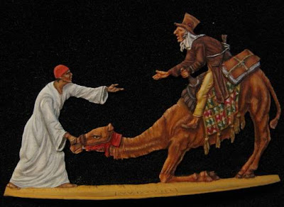
Above:
Figure from Mohr’s 30mm set of Napoleon at the Pyramids depicting French chemist Claude Louis Berthollet painted by the author.
Another trick that many painters use is the painting of a cast shadow. This is the shadow that is produce from an object that gets in the way of the light source. For example a sword hanging from the side of a figure casts a straight shadow onto the trousers. Many times during painting we use two certain techniques people call dry-brushing and wash. They mainly come from armor modeling but can be of some value to flat figure painting. For the first technique we take some color with our brush, wipe it almost clean onto a tissue paper and we brush a surface lightly so any raised detail will be softly painted. In this way we can produce some grainy textures or make some raised details stand out. Remember to wipe the brush of almost all of the paint otherwise a brush stroke will be visible onto our figure. Always test it onto the paper before you touch the figure itself. Wash is a kind of reverse technique. When we want to define some shadows more we can use a wash of the shadow mix at the crevices and folds of our figure by using a very diluted mixture of our shadow solution thinned with thinner to high ratios of 1:8 and above. Its better to be more diluted and to repeat the process a couple of times than to actually put a splash of the shadow color if its not thinned enough. Again test it onto tissue paper before touch the figure. Although these two techniques sound easy and promising, not many painters use them on flat figures but they prefer to produce similar results with actual painting and blending.
 Left: Another figure from Mohr’s 30mm set Napoleon at the Pyramids of a soldier clearly shows us the effect of the cast shadow of the weapon onto the body of the soldier, painted by the author.
Left: A scene from Carl Spitzweg geniously painted by Kevin Dunne showing the use of shadowing and highlight in achieving geometrical patterns out of nowhere, like the small table or the glass sphere.
A specific technique that uses wash and it can be really helpful for us, produsing some spectacular results is glazing. This is simple a highly diluted wash of a certain color that can change the overall appearance. For example if we paint a white tunic and we want to give it a colder appearance we can use a glaze of very thinned blue color. This way white will acquire a cold blue cast but still will be white to our eyes. It may be needed more than one washes but again its better to do it in steps than to actually make our nicely highlighted and shaded white tunic a blue tunic.
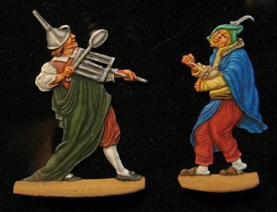
Above:
Figures from Mohr’s 30mm set title “Das Bohnefeast” painted by the author. Observe how lights and shadows produce shapes and three dimensional feeling even in such tiny surfaces. Remember that a face is half the size of a head of a matchstick in this scale.
Figures from Mohr’s 30mm set title “Das Bohnefeast” painted by the author. Observe how lights and shadows produce shapes and three dimensional feeling even in such tiny surfaces. Remember that a face is half the size of a head of a matchstick in this scale.
The next two chapters will present various painting mediums along with some photos with figures painted with each specific medium. What anyone chooses is his or her own choice as long as he/she feels comfortable working with it. What must be remembered is that by observing other people’s work or reading about it and then assimilate it into our own style is the key for a successful, enjoyable painting.
No comments:
Post a Comment