An excellent article about painting figures in acrylics by Mario Fuentes.
http://www.ttfxmedia.com/vallejo/cgi-bin/_modelis.asp?p1=ing&p2=modelcolortecnicas
Saturday, 30 June 2007
Thursday, 28 June 2007
La Sellerie - Le Harnachement
By Panos Charalampakis
Here is a collection of various drawings about saddles and harnesses by Historex.


Here is a collection of various drawings about saddles and harnesses by Historex.


Wednesday, 27 June 2007
Color Mixing
Color Mixing by William F. Powell
This information is published by William F. Powell as an aid for painters who need assistance in color theory and mixing and may not be altered, copied, reproduced downloaded or distributed in any manner without the written permission of William F. Powell. Thank you for your cooperation.
Some General Guidelines
All color mixtures come from the three primary colors, yellow, red and blue. When we mix these three primary colors together, we obtain a neutral gray. However by mixing only two of the primary colors together, we obtain colors known as secondary colors. For instance, primary yellow and primary red make the secondary color orange, red and blue make the secondary color purple and blue and yellow make the secondary color green.
Think of a tube of white as a tube of light...not white paint. If we do this, we use it in a similar manner that light rays affect colors we see. White can be considered a combination of all visible colors since all perceived color comes from white light.
If white paint is considered white light, then black paint must be considered darkness and therefore the absence of light and of course, color.
Colors directly opposite to one another on the color wheel are known as direct complements. When these complements are mixed together they neutralize each other. Any direct complement has the ability to neutralize its complement more than any other color on the color wheel. When these colors neutralize one another, they make a gray.
When any of the neutralized gray colors are mixed with a pure color, they will neutralize the pure color and create a softer and less gaudy version of the color.
Experiment with color by mixing a color with its complementary (color directly opposite on the color wheel) to gray it rather than reaching for the black. Mixing black with a color does not gray the color. Black only shades a color (takes light away from it) and the color is not as fresh as when mixed with a complementary color.
To obtain softer and more pastel mixes of colors, try intermixing white to the two basic colors to lighten the value of each and then mix the lightened versions together. This will result in some delicate values that can even be lightened more, brightened by the addition of one or both of the basic colors and/or bronzed by adding complementary colors.
Experiment with color mixing and do not be afraid to try something new.
Make notes of everything you do! If you come up with mixtures that work, and have made step progression notes all along the way, you will be able to repeat the process again. Without notes, the mixtures are lost forever. When making notes, place a swatch of color alongside the formula. If you don't, the mixture will be difficult to repeat and the exact value of the mix is lost. (see my book "Understanding Color" published by Walter foster Publishing, Inc. for numerous examples of notes, color smearings and swatches).
Never mix thinners directly into your paint as it washes away the bonding agents and oils and leaves a very weak and dull finish.
Do not be discouraged with your efforts in early color mixing. It comes slowly but surely with practice!
Arranging Colors
Try to think of colors in families. Categorize and arrange them into family groups such as yellows, yellow greens, blue greens, blues, blue purples, purples, red purples, reds, red oranges, and oranges. By doing this, you have created a group of color families that compare with those on the color wheel.
Color Strength / Warmth and Coolness
The strength of a color does not affect the warmth or coolness of that color. Strength only relates to the ability of one color to tint and neutralize another color. For instance, prussian blue is intensely strong and will tint white quickly and overpower most other colors. Manganese blue on the other hand is very weak and it takes a lot of it to tint white and affect other colors. A spec of prussian blue added to white will create a noticeable tint of blue. The same size spec of manganese blue added to the same amount of white will hardly be noticed. Though these two blues are both considered cool blues, their strengths vary greatly.
Controlling the Warmth or Coolness of Color Mixes
Remember that the more red a color contains, the warmer it is considered to be while the more blue a color contains, the cooler it is considered to be. In each color family, there are warm and cool colors.
For instance, a yellow that appears to have an orange tone contains more red and is considered warmer than a yellow that contains blue which makes it appear to be greenish and cooler. There are warm yellows (those containing red) and cool yellows (those containing no red and a bit of blue).
As a visual exercise, place a small swatch of all of your yellows in a line and notice how individual they are. Some look orangish (warm) and others will appear a bit greenish (cooler)
The same thoughts are applied to the colors in the blue family. The more purplish a blue appears to be, the more red it contains making it warm. The more cool yellow a blue contains, the more greenish it becomes making it appear cool.
Lay your blues out in a line the way you did the yellows and notice the difference of each color. Dark colors absorb light rays and are difficult to see. In order to see the dark blue colors well, add a touch of white to the darkest blues. If you are using a white palette, you can also scrape the mixes on the palette making a thin transparent glaze of the pure colors. This will allow you to see the white of the palette through the dark mixes creating a true sense of the pure color mix.
Some Color Mixing Formulas and Color Families
Following are some thoughts and guidelines to assist in arranging color mixtures into families and still control the warm and cool tones of each.
Greens have always been a problem mix for many students. Because of this, let's mix some greens. When mixing these, make notations whether they are warm or cool and dark or light.
We know that by mixing a yellow color and a blue color together we get a color known as green. The warmth of this green color depends upon the warmth of both the ingredients, blue and yellow. In the visual strength department, yellow seems to control the warmth of a mixture more quickly than a blue color.
Making Greens Look Natural
Study your subject and notice the toning of the different greens in the trees, shrubs, grasses and bushes. In nature, it is rare to find a bright - right out of the tube - green. If we find that a green mix is too bright, we can alter it by adding various colors to bronze the mix or white to lighten the tint or lighter colors to tint and weaken the mix.
Bronzing Greens - Lightening and Creating Delicate Greens
Bronzing Greens To make raw, bright greens appear bronze (or brownish) as they do on some foliage in nature, add a tiny spec of red or orange. Good colors to use for bronzing greens are: alizarin crimson (a cool red), cadmium red light (a warm red), cadmium orange, burnt sienna (a deep value of reddish orange), burnt umber (a deep value of yellow-orange). Phthalocyanine reds also act beautifully as a different bronzing color.
Mixing Light and Delicate Greens To make lighter and more delicate green mixes, study the subject and concentrate on the "delicate" tones of the color needed. When searching for a delicate color of green, instead of mixing pure yellow with a pure blue and then lightening the color, try mixing the basic yellow with white to get a lighter and more delicate tint. Do the same with the selected blue and then mix these two lighter and more delicate colors together. The end result mix can always be adjusted and strengthened with the addition of a spec of either or both of the pure colors and/or a touch of any complementary red to bronze.
To lighten a green, add more yellow along with a little white. Any other lighter color can also be added too but be careful not to mix too many colors together or a muddy green will result. There are however, no ugly colors! Sometimes we are just not thoughtful about how we use them. If they appear muddy and unpleasant, we most likely have used them in the wrong place and against other colors that make them appear out of place. I know of many beautiful, muddy greens along many creek banks in West Virginia.
Be thoughtful with your mixing. Test colors. Make the mixes happen, don't just hope it will.
Some green mixes to get started...
Here are a few dark mixes for interior of trees and foliage:
1. 2-burnt umber + 1-prussian blue = blackish green. Very dark green for underpainting dark interiors masses of bushes and trees.
2. 2-burnt umber + 1-phthalocyanine blue = blackish green. Also for underpainting
3. burnt sienna + phthalocyanine blue = dark rich green
4. ultramarine blue + cadmium yellow medium = dark, rich green
5. spec of phthalocyanine blue + cadmium yellow deep = dark, rich green
6. cobalt blue + cadmium yellow deep = dark, warm green (more dull than previous mix)
There are many, many more...experiment!
A few mixes for secondary light within trees and foliage:
1. 2 yellow ochre + 1 ultramarine blue = warm middle sunlight value green.
2. 3 naples yellow + 1 cerulean blue = cool middle value sunlight green
3. raw sienna plus ultramarine blue = warm sunlight middle value green
4. raw sienna + spec of phthalocyanine blue = rich middle value sunlight green
5. cobalt blue + spec of cadmium orange = rich middle value green
6. cerulean blue + raw sienna = dull middle value green
There are many, many more...experiment!
A few secondary highlight within trees
1. cadmium yellow medium + spec cerulean blue
2. cadmium yellow light + spec cerulean blue
3. cadmium yellow light + spec manganese blue
4. cadmium yellow light + tiny spec phthalocyanine blue
5. naples yellow + any of the above blues.
There are many, many more...experiment!
A few highlight greens (keep these on the yellow-green to yellow side)
The following are to be used as final highlights within the foliage and on areas where sunlight is strongest. Keep the mixes light and on the yellowish side. For the coolest appearing bright, sunlight greens, use both a cool yellow and a cool blue. For a slightly warmer but still cool and bright sunlight green, mix with a cool yellow and a warm blue.
1. Cool: zinc yellow + a small amount of any cool blue such as manganese, phthalocyanine blue, prussian blue, cerulean blue, etc.
2. Less cool: zinc yellow + a small amount of any warm blue such as ultramarine, permanent, cobalt, etc.
3. Warm or cool: hansa yellow + spec of warm or cool blue
4. Warm or cool: cadmium yellow pale + spec of warm or cool blue
5. lemon yellow + spec of warm or cool blueTo brighten and accent any of the above highlight yellow-greens, mingle an accent here and there with a spec of white + zinc yellow, white + spec lemon yellow, white + spec hansa yellow. Place these highlights here and there within the general highlighted area to emphasize the play of sunlight on the foliage.-------------For a lighter more bluish green such as the olive tree or eucalyptus, add a spec of cool yellow such as zinc yellow, a spec of cool blue such as cerulean blue, a spec of burnt sienna to bronze and a little white to lighten to value.
Some Color Thoughts Regarding Black and Blue Pigments
Any color that makes a green when mixed with yellow can be considered to be within the blue family of pigments.
Any color that makes a purple color when mixed with a cool red can be considered to be within the blue family of pigments.
Mix any black with any yellow and the result will be a greenish color! The green is more dull and not as chromatic as the pure pigment mixes but non-the-less, the result is still a greenish color!
Mix any black with a cool red such as alizarin crimson or phthalocyanine red, and the result is a purplish color. The purple is more dull and not as chromatic as the pure pigment mixes but non-the-less, the result is still a purplish color!
Now...this tells us that we have another avenue of green colors to try. Try mixing different yellows with different blacks.
There are warm blacks and cool blacks. For instance, ivory black and mars black are warm while lamp black is the coolest black available. Warm and cool blacks will result in warm and cool appearing green mixes.
You can mix your own version of a wonderful black by using equal parts of ultramarine blue + equal parts of burnt umber. The result is a charcoal black that can be cooled by the addition of more blue or warmed with the addition of more burnt umber.
A soft silver black can be obtained by mixing burnt sienna with ultramarine blue or cobalt blue or cerulean blue.
A rich black green can be mixed with burnt umber + phthalocyanine blue or prussian blue as used in the dark foliage above.
The real key to "Understanding Color" (the title of my first book...I couldn't resist the temptation) is practice! Experiment with mixtures and most importantly, make notes of every color you mix. If it doesn't work, no one will know...but if it does!!! you have the record of how you obtained the color and how to repeat the mixture again.
I hope the forgoing has been helpful to you in your color mixing and painting. The greens especially seem to be a real problem for many beginning painters. Hopefully this information will be of assistance. Practice mixing colors every time you have the opportunity!
Color Theories
By Rob Howard
COLOR THEORIES____The Good, the Bad and the UselessAlthough the use of color is not without pitfalls, unlikedrawing or pictorial composition, it is the most flexible andtolerant of individual taste of all the aspects of painting. Whilemany of us a seem to born with the ability to draw, few of us areborn colorists simply because good color can be achieved onlythrough an intelligent approach born of proper study.No other element of Art has more mystery surrounding it thanthe study of color. From that mystery have arisen countless colortheories. Some theories have strong foundations built on provenand observable fact. Other of these theories are, well---frankly,they are bizarre. In the beginning of this chapter we'll discuss abit of the history surrounding a few of the more bizarre and,unfortunately, influential theories which continue to bring newterrors to students of color. My opinions may fly in the face ofwhat you've learnt at university, but please give them a hearing.
In the chaos following the First World War, the ashes ofGermany became the breeding ground for a new social order.Socialism took firm root in the fertile ground of post-wardiscontent. Socialist thought crept into everything, even unlikelyareas like the arts, and it gave birth to the artisticmanifesto.With their many manifestos, the new men of the NewSociety shouted down figurative painting as merely "illustratingthe myths of the intellectual bourgeois." These new anti-intellectuals set about to create art forms which would becomeillustrations of their social and political manifestos.Out of that curious period came this call to arms of theNovembergruppe; "Painters, Architects, Sculptors, you whom thebourgeoisie pays with high rewards for your work---out of vanity,snobbery, and boredom---Hear! To this money clings the sweat andblood and nervous energy of thousands of poor hounded humanbeings---Hear! It is unclean profit . . . we must be truesocialists--- we must kindle the highest socialist virtue: thebrotherhood of man."Walter Gropius, apart from founding the Bauhaus, was alsochairman of the Novembergruppe's Arbeitsrat fur Kunst (WorkingCouncil for Art). He sought to join all of the arts together"under the wing of a great architecture." Appointing himself GreatArchitect and sounding much like the jackbooted men who would soonfollow, he wrote "the intellectual bourgeois has proved himselfunfit to be the bearer of a German culture." He predicted aBauhaus/Socialist New World Order arising from unsuspectedquarters when he wrote, "New, intellectually undeveloped levelsof our people are rising from the depths. They are our chiefhope." Unfortunately, he got his wish . . . and the world got Hitler.A common thread joined those art forms spawned by the newanti-intellectualism. Artistic movements like Futurism, Vorticism,Orphism, Purism and Surrealism, were distinguished not so much asaesthetic movements but as esoteric codes designed to baffle thehated bourgeoisie (never mind that later Socialists would rejectthese incomprehensibly coded aesthetic messages to seek comfort inthe most puerile and saccharine of bourgeois art, and never mindthat the artists themselves became the prototypes of thesuccessful capitalist). It was only natural that, in those giddyearly years, The Movement would produce its own peculiar theoriesconcerning politically correct ways of seeing. Rising out of thisyeasty mix of aesthetics and politics and armed with correct newcolor theories and a reformer's zeal, sprung Josef Albers andJohannes Itten.Albers and Itten's color theories had little to do with thepractical problems encountered by the figurative artist. To their way ofthinking, that was all to the better. But when World Socialism finallyrejected their ideas as counter- revolutionary, they, along with Gropius, beat ahasty retreat to those places still cordial to arcane and unprovabletheories...the universities. The sheltered hot house atmosphere of theuniversity provided a congenial rallying place where countless studentsjourneyed forth to kneel at the feet of their idols. The trouble was, thosestudents never got up off their knees--- they went on to teach thoseunworkable coded theories to the next generation of easily gulled students.Itten's book, The Art of Color, attempted to validate histheories through a clever technique well known in advertisingagencies. By juxtaposing his color charts next to the work ofgreat painters he hoped to add credence to his theories.Strangely, Itten chose painters who died well before the advent ofthe modern pigments and colors shown in his charts. Those greatmaster's pictures have as little bearing on his color theories asare the trim young models in beer commercials a result of drinkingthe advertiser's product.To appear original, Itten abandoned the ten-colorwheel of the Munsell System in order to create his idiosyncraticTwelve Color Star and a seven value Color Sphere. The dilemma was;how was the artist to apply rigidly circumscribed charts, blocks,stars and spheres of color to painting the delicate passagesinherent in figurative painting? Those uncompromising Bauhausprecepts have proved to be coarse, clumsy tools ill suited toproducing that grace and finesse we associate with figurativepainting. Thus far, the only application of Alber's and Itten'stheories have been in short-lived art fads like Color Fieldpainting and Op Art.I don't want to leave you with the impression that all formal colortheories are useless to the illustrator and painter. Quite the contrary.Unlike Albers and Itten (both of whose theories are never mentioned inserious writings on color), a few well grounded color theorists like FaberBirren, concentrated on practical color effects of use to the artist andcraftsman. Birren's book, Creative Color should be required reading for anyillustrator or painter. The color effects shown in Creative Color are asextraordinary as they are useful. Birren was not the only one to developpractical color theories with the artist in mind. Far ahead of its time wasthe fundamental work from which much practical color theory grows--- M.E.Chevreul's 1839 book, The Principles of Harmony and Contrast ofColor. It was from within this book that the color theories of theImpressionists took root. Although approaching color from a more scientificstandpoint Ogden Rood, Albert Munsell, Wilhelm Ostwald and Denman Ross allproduced work of lasting value to the artist.The Munsell Color System:A decade before the Novembergruppe issued its first artisticmanifesto in the city of Weimar, Albert H. Munsell had developedan elegant system of color notation in the city of Boston. Thatsystem has become the universal standard by which colors arejudged. It should be the standard by which color theories arejudged. Professor Munsell sought to bring color description awayfrom whimsical and confusing names like 'Firecracker Red' and'Chinese Red' into a standardized language by which color could beaccurately specified. He succeeded in doing much more than that.
Munsell separated color into three fundamental components.The first dimension was HUE, "The quality by which we distinguishone color from another, as a red from a yellow, a green, a blue ora purple." He divided the hues into ten equal steps on a band. Theband was bent around to form a hoop---the Color Wheel. In namingthe Hues, he did not use names like Orange. What is commonlycalled orange, for example, he called yellow-red because it is amixture of those two primary hues.The second dimension of color is the easiest one tounderstand. VALUE is "The quality by which we distinguish a lightcolor from a dark one." The scale used to depict value is avertical pole divided into nine increments of neutral grey. A pureblack was added at the bottom and pure white added to the top.CHROMA describes the brilliancy or strength of a specific Hueat any given Value. By extending a scale horizontally from theneutral pole of the Value scale, an easily understood graphicrepresentation of Chroma Strength can be made. Red is at its mostbrilliant (has its highest Chroma Strength) at Value 5 on theneutral pole, it extends on the horizontal scale to its maximumChroma Strength of 10. As the horizontal scale approaches thepole, the colors become more and more grey until, at a ChromaStrength of 1, at become almost a pure grey. Shorthand notationsare used which first list an abbreviation of the Hue followed bythe Value and the Chroma Strength separated by a slash and statednumerically.The scientific principles upon which this system is basedare beyond question. Since the inception of the Munsell Color System,hundreds of new colors and pigments have been introduced. Without exception,all of them conform to the system's principles. That is; no color can behigher in Value than white or below the Value of black. Every new color has aHue name which can be precisely located on the Color Wheel. The variablescale of Chroma Strength can be logically extended to accommodate morebrilliant pigments as they become available. As an example, when ProfessorMunsell designed his system, the Red Hue at Value 5 attained its highestChroma Strength of 10 (the Munsell notation is R 5/10). How can the Munsellsystem accommodate the fluorescent pigments which were undreamt of in thebeginning of the century? Quite easily. The complete collection of HolbeinDesigner Gouache has a fluorescent color called 'Opera." Its Hue is describedas a 7RP, meaning a Red with a cool overtone. The Value is described as 5.5.Because of Opera's fluorescent pigment, its Chroma Strength is a whopping18.5, almost twice that of the original Value 5 Red. Opera's Munsell notationis the rather longish 7RP 5.5/18.5.Earlier, I stated that Professor Munsell achieved a greatdeal more than creating a neat system for cataloguing colors.Residing within his system is a well conceived plan for achievingcolor balance. In comparing the Chroma Strength of Value 5 Redwith the Chroma Strength of its visual complement, Value 5 BlueGreen, we can see that although the Chroma paths touch at theneutral pole, the Chroma Strength of Red extends to twice that ofBlue Green. If we mixed equal parts of Red with Blue Green wewon't get a perfectly neutral grey, but one in which the Redpredominates very decidedly. It would be like a tug-of-war withten men on one side, each representing a step of Chroma, and onlyfive on the other side.
Visualize a bar representing the five stepsof Chroma for Blue Green and the ten steps of Chroma for Red. If thebar rests upon a fulcrum at the neutral point it obviously willnot balance. But if we cut off steps 6, 7, 8, 9 and 10 from theRed side of the bar, it will balance upon the fulcrum, or neutral grey. It isthis simplicity which is characteristic of the Munsell Systemthroughout.Of course, as artists, we don't want to be limited to usinghalf-strength reds in order to balance its complement. We musthave other means at our disposal for attaining balance. If ourpurpose was merely to make a neutral grey, we would use a greateramount of the weaker color. If we wish to produce a balanced andharmonious color design, we can employ a larger area of the weakercolor. If we do this in the correct proportions, relative to theChroma Strength of each color, we will attain balance. It's asthough we used ten blocks of the weaker Blue Green (BG 5/5) tobalance five blocks of Red (R 5/10).For the artist, all of these color theories have a majorshortcoming---they do not deal with artist's paints, especiallyopaque paints. Chevreul's admirable work was created primarily asan aid to the weavers at the Gobelin tapestry works. By layingsmall dots of color next to each other, like stitches of coloredthread, the Pointillists were able to make full use of histheories. On the other hand, mixing pigments on a palette does notproduce the same results. Thus, not all of Chevreul's theorieswere applicable to the pictorial painter.While it lies at the foundation of modern color theory,Munsell's color system does not easily accomodate itself to makingaccurate mixtures with artist's colors. Early in the 20th century,attempts were made to locate the complements of various artist'spigments. The Dudeen Color Triangle was one of those earlyattempts. The Dudeen Color Triangle was not widely acceptedbecause it was, to be frank...poorly designed. The Modular ColorSystem was another system designed to be used by artists. It wasan elegant and useful system designed by Nathaniel Jacobson andintroduced in 1975 by Liquitex. It consisted of a set of acrylicsformulated to have the highest Chroma Strength according to theirparticular Value. A set of Reds would range through the Valuescale from pale pink down to deep maroon. Aside from Red, theModular System included various values of Neutral Grey, Yellow,Green, Purple and Blue, all arranged according to their positionon the Value scale. It was very easy to use. Sadly, it was notgreeted with the success it deserved. Perhaps we artists needpoetic sounding color names, like Cadmium Red Light and LightPortrait Pink rather than R5 and R8.Color mixing was made much more understandable in 1989 withthe publication of Stephen Quiller's Color Choices. Quiller is anaccomplished landscape painter whose work is distinguished by hisexcellent use of color. He mixes color with his brains---and acolor wheel of his own invention. The Quiller Wheel is createdfrom actual artist's paints, not printer's inks. Thus, CadmiumOrange lies opposite Ultramarine Violet rather than the Munsellnotations of a 4 Yellow Red across from a 9 Purple Blue. Althoughthere are variations between manufactures, the true complements ofartist's paints are located on the opposite side of the wheel---nomore color shifts resulting in 'mystery mud'. Quiller's colorwheel is the foundation for an easy-to-understand color course.Landscape painting offers great latitude for demonstratinga variety of spectacular color effects. Landscape offers far greater latitude thanthat is allowed by the subject matter of most illustrations---people and products. Still, Quiller's sensible approach to colormixing makes this book one of the most useful books the painter orillustrator can own.During Hans Holbein's day, color theory was a moot point. Youjust couldn't build much of a theory around a palette with onlyhalf-a-dozen colors. As more colors became available and the useof color became more than merely tinting monochrome pictures,color became the subject of serious study. But that study wasalways done by the practitioners---the artists. Rubens certainlydidn't need a theorist to tell him that blue was calming, red wasenervating and yellow could be cheerful.Over the centuries new colors were slowly added to thepalette. But with the discovery of aniline dyes in the 1850's arainbow of brilliant colors exploded onto the market---colorswhich found their first use in women's fashions. What followed wasa demand for portraits of women wearing those brightly hueddresses. That in turn, created a demand for paint manufacturers toproduce the brighter pigments needed to adequately depict thosenew fashions. It was this bright palette of colors that theImpressionists and the Pre-Raphaelites inherited.Fortunately, techniques for the practical employment of colorin pictorial (not abstract) paintings has been passed on to us bynumerous illustrators and painters. Howard Pyle, Harvey Dunn,Norman Rockwell, Andrew Loomis and Frank Reilly are a few of theworking artists who wrote extensively concerning the effective useof color in painting. Their approach to pictorial painting wasbased on the observations we all make when observing nature. Theybelieved that, if in looking out a window you saw an area of greensituated below a large expanse of blue, you'd be right in assumingthe green represented grass and the blue was that of the sky. Ifyou looked out the same window and saw blue on the bottom andgreen on top, you might suspect that someone had turned your houseupside-down. Despite newer theories, we still hold those truths to be self-evident.
The use of color in pictorial paintings derives from equallysimple observations of nature. The information resulting fromthose observations is known to everyone, not only artists. If youdrew a picture of a person with one too many fingers, the mistakewould be obvious to anyone. Like the odd products of Bauhaus colortheories, drawings of six-fingered people just won't convince mosthumans. Of course there will always be a self-proclaimed elite whocan persuade themselves into seeing The Emperor's New Clothes, butthe rest of us still remain unconvinced and, like Queen Victoria, not amused.I won't try to persuade you that learning to use color iseasy. It's not---but following these suggestions will help keepyour paint clean and bright.First: always keep your brushes clean. Use copious amounts ofwater or solvent to clean your brushes. Dirty brushes (and dirty water or solvent)will turn the brightest color mousy and dull.Second: do not allow the colors on your palette to run intoeach other. Be especially careful that you do not dip into acolor with a brush which contains another color.
Third: Keep your eye on the white paint on your palette. Ifyour brush is contaminated, it will show up here first.Fourth: use your grey card to compare the values of yourcolor mixtures. The grey card helps you to get it right thefirst time, thus avoiding an overworked picture. Properlychosen values are the key to convincing color.Fifth: get a color wheel. It will make order out of thechaos. Grumbacher's Color Computer is handy because it helpsyou to find direct, split and triadic complementaryharmonies. It also shows tints (colors mixed with white),tones (colors mixed with grey), and shades (colors mixed withblack). Far and away the artist's most useful color wheel isthe Quiller Wheel, of which we spoke earlier.Sixth: your palette is one of your most important tools. 90%of an artist's work is done on the palette; tones and colorsare tried out, as well as the thickness or thinness of thepaint. The palette must be kept clean and organized becauseit is where you do your thinking. Your painting can be nobetter than your palette.
PAINTING WITH COLOR: The Short CourseRather than approach color as though it was some sort ofspecial science, let's approach it with the knowledge we'vealready developed as artists.* We know that, to be successful, all pictorial paintingsmust be based upon the structural truths of tone, light andshadow.* Color is not only subject to the same pictorial approachgoverning tone, light and shadow; but also to the effects ofatmosphere and reflected light.Colors and their Characteristics:In order to use color in a pictorial painting we must be ableto carry any color from its lightest value down to completedarkness. Although nature contains far darker darks andlighter lights, Black and White represents the extreme valuerange of opaque paints. Although any color can be lightenedor darkened with white or black, that method seldom producesthe most brilliant (highest Chroma Strength) color for anygiven value.YELLOW:Although you can get a wonderful richness by using Black tolower the value of Purple, using the same Black to lower thevalue of Yellow will produce, not a darker yellow but anOlive Green. However, lowering Yellow's value is easy onceyou understand that many of the earth colors like YellowOchre, Raw Sienna and Burnt Umber are just duller, darkeryellows. Because it is located near the top of the Value scale,the value of Yellow can only be raised with White.PURPLE:The various shades of Purple, or Violet are very important increating the shadow areas of its complement---Yellow. Don'tforget, Alizarin Crimson is a violet, not a red. AlizarinCrimson mixed with Pthalocyanine Blue produces a dark purple.Alizarin Crimson can also be mixed with a small amount ofPthalocyanine Green to produce a cool violet. AlizarinCrimson mixed with a Neutral Grey produces a wide range ofvery useful violet tones.RED:Red can be very difficult to paint with because so many redpigments have cool overtones which aren't apparent until youtry to mix them with other colors. Cadmium Red Medium andCadmium Red Deep turn almost violet when mixed with White.Until you're really familiar with your colors, use CadmiumRed Light for your bright red. When raising the value ofCadmium Red Light, mix a tiny touch of Orange into your whiteto keep it from getting cool. You can also use a premixed "Flesh" insteadof White to lighten your reds. In order to maintain thecharacter of Cadmium Red Light while lowering its value, mixit with Alizarin Crimson tempered with a bit of Burnt Umber.ORANGE:Cadmium Orange is the most useful orange pigment. It can bedarkened with Burnt Sienna and lightened with Flesh or NaplesYellow mixed with White.GREEN:Straight from the tube, Permanent Green Light is the highestchroma green. It's also difficult to use in pictorialpainting. Pthalocyanine Green is very dark but staysbrilliant when brought up in value with White.BLUE:Pthalocyanine Blue has extraordinary tinting strength. It'svery dark as it comes from the tube, but if you needadditional depth to your blue shadows, add Burnt Umber.Pthalocyanine Blue (Winsor & Newton calls theirs Winsor Blue)can be lightened with White. Be careful when mixing it withother colors because a little bit of Pthalocyanine Blue goesa long way.WHITE:Before we go any further, let's discuss the different typesof white paint and their proper uses. Titanium, or PermanentWhite should not be mixed with colors unless you want pale,chalky pastels. Titanium White is useful for creating opaquewhite passages against dark backgrounds. To lighten a colorto a clear and bright tint, it must be mixed with Zinc White.The virtual unavailability of Zinc White in acrylics accountsfor much of the chalkiness seen in pictorial acrylicpaintings when compared to oil and gouache paintings.Although gouache dries to a matte finish, gouache colorstinted with Zinc White show far greater brilliancy and depththan similar tints made with acrylics mixed with Titaniumwhite.BLACK:Just as some white pigments are better mixers, the same canbe said for blacks. Ivory Black is the most transparent ofthe blacks. It darkens colors without overwhelming them.
* Pictures which are built on a few basic values---a light,one or two middle tones, and a dark---seldom go dead.* Large amounts of pure, bright colors won't producebrilliant pictures. A patchwork of colors and values placedagainst each other, compete for attention and the brilliancyof the whole picture becomes reduced.* One primary plus its neighbors, opposed by itscomplementary will never go dead. These colors, supported byneutral and semi-neutral colors, plus black and white, willalways be brilliant...always.* Mix your colors from as few colors as possible. Every coloradded to a mixture reduces its brilliancy.* Large areas of color should be toned down with a complementor grey, in order to give other colors a chance. Remember theaxiom, "The larger the area, the softer the color needs tobe."
Here's an interesting fact:
The size of a pictureeffects our perception of its color harmony. Bright colorscan be quite pleasant when used in a small color sketch, butwhen we use the same colors in the enlarged version, thecolors appear coarse. The reason lies in the limited numberof color cones in our retina. Because we have only so manycolor cones to register the different color vibrations, oureye tires quickly when scanning large areas of color. Theillustrator whose pictures are photographically reduced forreproduction should understand and exploit this phenomenon.A common cause of dead pictures is too much raw unrelatedcolor rather than not enough. Here are some ways to bring yourpicture back from the dead.* Trying greying all but two colors.* Tie your palette together by mixing a single color into allbut one or two of the other colors.* Create your pictures with simple tone plans consisting of alight tone, one or two middle tones, and a dark tone. Keep itsimple.* Reduce your palette to three or four basic colors fromwhich you'll mix all the rest. This is a lot easier and moreeffective than it sounds.* Don't put bright colors into your shadows.* Put your brightest colors into areas of light, especiallytransitional areas where light meets shadow.* Never use all three primaries in their pure state, in thesame picture. If they are there, that's your source oftrouble. Tone two of the primaries with the third one. Onlyone primary should dominate.* Introducing black, white or grey can help restore thebrilliancy of a picture which is too full of color. You haveto sacrifice color in one place to gain brilliancy elsewhere.* If the picture doesn't respond to any of the above, itmeans that the values are wrong. The overall relationship oflight to shadow has gone wrong. A color cannot be right untilits value is right.I know that much of this goes against what you think comprises goodcolor, but these aren't my rules...these are nature's rules. Stick yourhead out of the window. What do you see? If your studio is in the city,you'll likely see a lot of greys and dull browns. But if your studio isin the country, you'll still be looking at lots of greys and browns. Mostof the permanent things in the landscape; earth, tree trunks and rocksare greyed down colors. Except on golf greens, most grassy areas aregreyed or brownish greens. The bright colors are reserved for rare andfleeting effects; flowers, sunsets, fruits, feathers and the spectacularcolors of autumn. Those bright colors always appear to be at theirmaximum brilliance because they are surrounded and buffered byneutralized tonalities of themselves. Perhaps there's an important lessonawaiting on your next walk through the fields.
Light and Shadow:Outdoor light comes from the sun, not the sky. That's whysunlit highlights are warm, especially as we approach sunset. Theblue of the sky reflects into the shadows causing shadows toappear cooler than the lights.In a studio with a north facing window, the opposite is true.Because there is never any direct warm light from the sun, theblue of the sky reflects its cool light through the window.Because of optical contrast, the shadows appear warm. Your pictures will become livelyand lifelike if you remember to create a warm/cool interplaybetween, and within, your shadows and your lights.Shadows are affected by more than just the warm or coolreflections of the light source, thus we have the axiom, color isrelative to all surrounding influences. What this means is, theareas of a warm yellow cube illuminated by a warm light sourcewill get warmer and more intense, while the color on the coolshadow side will become neutralized. If we place the cube on ablue ground, that color will be reflected up into the shadow. Someof the blue would mix with the yellow causing the shadow to lookgreener than the above example. We call the actual color of anobject its "local" color. Yellow is the local color of the cubesused in our example. This brings us to yet another axiom, localcolor should never completely lose its identity in the shadow.All colors are modified by the conditions surrounding them.Warm light shining on a warm color will give it greater brilliancy. Thesame warm light shining on a cool color will subtract brilliancy.* When struck by light, all colors become a source ofreflected light and will reflect themselves into adjacentshadow areas.* All colors in shadow take on the reflected colors of theadjacent light struck area.* Any two colors become harmonious when one (or both) aremixed with some of the other.* No color can be more intense in shadow than it is in light.* Colors at their greatest intensity should be relegated tothe lights and halftones. In shadow, these colors should begreyed or neutralized---or changed by the influence of theadjacent colors.* The most brilliant colors are usually found in thehalftones.Although the painter's axiom of, greys make the picture hasmuch to recommend it, too many neutral greys can deaden a picture.Overly neutralized greys can be fixed by "spiking" them with thecolor they lean toward. Although this technique is particularlyeffective in the halftones, shadow colors can also be intensifiedto good effect. However, to avoid a gaudy and unconvincingpicture, greater delicacy and taste must be used when spikingshadows.Pre-mixed greys can be very useful to tone down colors without alteringtheir value. If we hold a color, let's say Flame Red, next to ourgrey card we see that it's between a Value 3 and a Value 4---mytube of Flame Red is a Value 3.5. By mixing increasing amounts ofgrey with the color, we can lower its intensity without changingits value. If you paint a square with the toned down mixture andplace a square of the pure color in the middle, the color willappear to be much more brilliant than if just painted on white.Experiment with varying proportions of grey and red. See how easyit is to create the effect of a glowing red area. If you squintyour eyes the differences between the pure color and grey willdisappear. Remember, if you photograph this with black and whitefilm, it will look like the entire square has been painted in aValue 3.5 grey.Colors which are direct complements, meaning they appeardirectly opposite each other on the color wheel, will usuallyneutralize each other if mixed together. The neutral and semi-neutral tones made by mixing direct complements are called visualgreys. One of the best known combinations is Alizarin Crimson andViridian. The chart shows three values of a neutral mix at thetop. The three values in the middle are semi-neutrals favoringAlizarin Crimson. The three values at the bottom are semi-neutralsfavoring Viridian. The same system applies to the other examples.Learning to mix and use visual greys is one of the mostuseful skills a colorist can develop. I spent more than a yearpainting with nothing other than mixtures of Ultramarine and RawSienna. I never exhausted the possibilities offered by those twocolors. Painting with such a limited palette gave me a greaterappreciation of color. Again, this is something which must beexperienced firsthand. Pick two complementary colors and execute apainting. Although you may use a full range of values, you'llprobably not use the full range of color. This execise is a realeye-opener. I recommend it.Like many of the techniques in this chapter, the followingtechnique was first shown to me by Andrew Loomis in his classicbook Creative Illustration. Although the illustrations in Loomis'book may appear dated, his solid advice is timeless. In order togive you the flavor of Loomis' approach, I'll quote him directly."Here is one of the best ways in the world to obtainbrilliancy of color: Keep your color most intense on the edges ofthe lighted areas, where it merges into shadow. This seems to castan aura of additional color over the whole area. Just taking alocal color of the light and rubbing it into a darker color of theshadow (which most of us do, most of the time) produces nobrilliancy. It is apt to be just color in the light, then mud,then reduced color in the shadow. This is one of the least knownand least practiced truths." It also is one of the best and mostuseful pieces of advice I've ever received.That wraps up the our abbreviated introduction to colortheory and basic color principles. I hope that the information inthe beginning of this chapter saves you from wasting time withdead-end color theories that just don't work. Don't expect toabsorb everything after reading it just one time. Let it sink infor a while. Experiment by applying these principles to littlecolor sketches. If you run into any trouble, come back to consultthe "bullet points" in this chapter or Stephen Quiller's ColorChoices and Andrew Loomis' Creative Illustration. If I werelimited to owning just two books about color, these would be the two.
Painting Tattoos
Author Unknown
I am an oils guy, and I have recently done a couple busts with tattoos. I paint all my flesh tones as per usual. Let them thoroughly dry (2-3 days). I then mix up my tattoo color with my oils. I use sap green, phthalo blue, paynes gray, and usually just a smidge (tiny bit) of yellow ochre (ochre really helps to "gray" down the mix and since I use this in my flesh tone mix, helps tint the color to the flesh tones) until I get what I see as a satisfying color. Somewhere in the bluish to kinda greenish range. I then use one of my smallest "liner" or "spotter" brushes to apply the paint (usually around 5/0 to 10/0 brushes depending on what I'm painting and where). These brushes are generally thin and keep a nice sharp point when painting.One thing to mention here, I ALWAYS plan the tattoos ahead of time with a small sketch or, what I do with almost all my figures, is bring an image of the figure into Photoshop and work out what I want to do before I start painting so I have a good reference with me while I work on the project. This has proven particularly helpful when doing tattoos, because I draw them on the figure freehand with no reference lines to start with. Any type of reference would look unrealistic at this scale. Particularly since the paint goes on VERY transparent and would show the reference lines underneath.I apply the paint in VERY thin coats. I keep very little paint on the brush, just enough to hold the point. I then apply it as if dry-brushing slowly drawing the basic shape of the tattoo on the surface. This is a slow build up of color. It goes on quite light and transparent at first as I build up the color to what I think is satisfactory. I let the paint stay just a bit "modelled" and not perfectly even as to let it appear a bit worn. The beauty of painting with oils is the fact that they stay wet more than long enough for you to make any corrections right away with thinner should you need to correct a line or two. I go back and forth, paint a couple lines, fix what ails them, and so on. One other thing to mention here would be shading. I have seen tattoos painted with highlight and shadow on them before. I don't really agree with this, to a point. Tattoos are generally perfectly flat on the skin and would generally not get a great deal of catch-light or strong highlight on the top (overhead lighting technique). So, because I am applying mine in so transparent a manor, I basically let the underlying flesh tones do my shading. I might be tempted to add a bit darker color for shadows if the tattoo goes somewhere to require that, but generally, if it is out in the open it will stand on it's own adequately without forcing too strong highlights and shadows.
Painting Silver Lace
By Lou Masses
For the complete article of Silver lace and more articles including one about gold lace visit Lou Masses excellent blog at https://home.comcast.net/~lrm1/
While essentially the same technique as painting Gold lace using only yellows. Replicating silver can be a bit more daunting because from a distance it looks well, white. The figure at right (Poste Militaire's Officer of Orleans Cavalry) was painted in oils and acrylics but all of the lace both on the figure and the saddle are white and grey. The key difference between painting gold lace using yellows and silver lace using whites is that with silver, the highlights tend to be more extreme.

 Photo 1
Paint the entire area in a coat of black-grey. It's important to do this in thin layers vs. thick coats because the last thing you want to do is obscure surface detail-without it, you're stuck.

Photo 2
Mix the base coat with a lighter bluish grey. Using that mix, carefully paint all raised detail except that which would not be exposed to light in any way (such as the part of the saddle at right in the shadows). At this stage it is ok to have most of the detail painted in the lighter tone if it is actually exposed to light in any way.

Photo 3
Carefully go over all areas that have more exposure to light with a mixture of the second tone and white. (see sidebar on the best way to tell where to apply the paint). At this stage it's starting to look like something. Be careful however at this stage not to over do it.

Photo 4
Now for the very highest highlights use a very light grey applying it only to areas that would catch the most light. Again, with silver, unlike god, you will have more areas that reflect light. Look at the arrows at right to see.

Photo 5
Using white, touch the tips where the most light would hit-apply only to areas that would capture the most direct light possible. If you compare the two pictures at right you will see that only the very tops of surfaces are affected.
Viola! You're done. While time consuming, because you are effectively just layering the paint, it is not as overly complicated as you might think. The most important aspect to understand is the effect and position of the lightsource you are trying to replicate. Without an understanding of that, the whole thing will just blend into itself and will end up looking white.
There are actually two ways to practice this technique that might help you learn the effect of light more quickly. One is real easy, simply look at paintings of soldier wearing lace. You'll see that the artist replicates the lace using yellows or whites and grays only yet your eye is fooled into thinking it is actually metallic only because the manipulation of light. The other method is to photograph your figure under a lamp and note carefully where the light hits and where it doesn't. The best thing to do is to prime you figure, place a 100 watt lamp over it (do not use flash) wherever you would like to see the light coming from, and photograph it. You will see EXACTLY where the shadows and highlights are supposed to go.
Painting Gold Lace
Painting Gold Lace by Matt Springer
Here is some info on how I paint gold lace without using metallic paint. In this case, I've used the technique on this 75mm figure from Pegaso Miniatures. Unless mentioned, all colors are Vallejo Model Colors.
I start with a base coat of Burnt Umber on all the gold lace areas. As with all acrylics, I apply the base in several thin coats to assure good coverage and also to prevent the loss of sculpted detail that thick coats of paint can hide.
Once the base coat is dry, I mix a little Yellow Ochre into Burnt Umber and with a good detail brush (W&N Series 7 Red Sable) I apply the paint in small lines across each section leaving some of the base to show through. Once this dries, I do the same with more Yellow Ochre added to the Brown Umber and add more small lines in only in smaller areas than before that are more directly exposed to light. Next, the same is done with pure Yellow Ochre and then yet again with Yellow Ochre plus Golden Yellow. Final highest highlights are pure Golden Yellow. Once done, I applied a glaze or a wash of burnt umber and a bit of yellow ochre to unify and bring all the tones together. The key is to leave some areas with little highlights and have others with lots of highlight to create large jumps in contrast from one lightening stage to the next. This helps create the illusion of reflectivity associated with gold lace without using metallic paint.
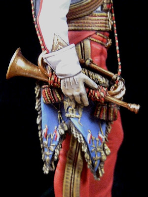
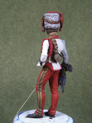


Painting a Flat Cavalry Figure
Artist Unknown
Without coming into too big a theoretical storiy I just decided to show at this page how one of my flats has been painted. I just explain what colour is used and hope that most of that what I was doing will be self-explaining by added pictures.
 Picture 1
After priming of flat using HUMBROL mat white *, I started with face and headdress. The face and its natural appearance will always "make or break" a flat or any other miniature. If to choose between frog-eyed guys and "blind" I always choose the last option. So most figures on these pages don´t have any visible eyes painted (though I have produced some frogs before, too). Oil used are of "MUSSINI" brand.
For some reason a face will never get a complete satisfying appearence with first paint. So I added some more light and shades after first paint has been dried completely. I useed 30% Naples yellow deep and 70% English red light for basic fleshtone. Lights beenig added with a mixture of 10% Naples yellow deep and 90% opaque white and a third layer of pure opaque white. Shadow area at face - here coming from busby - has been added with English red deep .
The Busby has been painted with mixture of 40% Vandyke brown and 50% lamp black (being more dark than ebony black) and 10% brownish grey . Lights beenig added consisting of a mixture of 50% brownish grey and 50% opaque white.
* I use the essence only, thinned seperatly with turpentine substitute as HUMBROL´S thinner is less "liquid" than requested.

Picture 2
I added pure lamp black at shadow areas of busby after first paint has dried completely. During drying procedure the white will always getting darker and vice-versa. This effect is very nice where this is requested, but where hard contrasts are required, a second paint (at least) will be necessary.
Here a light brown horse colour was chosen, which consisted of English red deep, yellow raw ochre and a little black. Lights have been made from Naples yellow deep, cadmium orange and yellow raw ochre. Shadows were again executed with Vandyke brown. Moreover I added some pure English red deep to some parts ttrying to achieve a more natural appearance.My blue colour consisted of 80% indigo and 20% Prussian blue.(BTW: I don´t like the pure Prussian blue colour mostly used for blue uniforms being much too colourful and greenish, especcially when high-lightend with white) Light and shades were added using Opaque white and Lamp black added to basic colour.
Here a light brown horse colour was chosen, which consisted of English red deep, yellow raw ochre and a little black. Lights have been made from Naples yellow deep, cadmium orange and yellow raw ochre. Shadows were again executed with Vandyke brown. Moreover I added some pure English red deep to some parts ttrying to achieve a more natural appearance.My blue colour consisted of 80% indigo and 20% Prussian blue.(BTW: I don´t like the pure Prussian blue colour mostly used for blue uniforms being much too colourful and greenish, especcially when high-lightend with white) Light and shades were added using Opaque white and Lamp black added to basic colour.

Picture 3
After drying completely again (!) I added a first layer of grey using Opaque white, Lamp black and a little bit of Prussian blue. Then I executed a "priming" of light carmine at parts of uniform. This is necessary, as this colour mixed from Alizarin madder lake deep, Cadmium red deep and Caput mortuum is still very transparent and wouldn´t show at all without a priming.
Furthermore added a second layer of very thin colour on blue parts of uniform to receive a better contrast. The reason to do this in a second step is the following : When trying to execute at first shading process it is far more complicated to achieve a neat structure of paint.
Furthermore added a second layer of very thin colour on blue parts of uniform to receive a better contrast. The reason to do this in a second step is the following : When trying to execute at first shading process it is far more complicated to achieve a neat structure of paint.
 Picture 4
After drying completely again, I added a second layer of colour to horse for deeper shadows (especcially mane and tail) and better defined lights.Added shadows to blue uniform and worked on contrast with grey (silver) parts.
 Picture 5
 Picture 5
After dryed completely adding various layers on any part where needed. Only new part to be added was red stripe on shabraque and some light and shade on trowser piping which was executed with Caput mortuuum and Lamp black.
But I have to mention, that my decision to work with many thin layers of colours on a basic paint leads to a "shabby" effect which is requested. I know that on the other hand, that many painters prefer a "clean" appearance of flats. I don´t like this for giving always an artificial attitude. But this being a matter of personal taste.
But I admit there being at least one problem with my method of painting: I never know when being finished with my figure. When looking at them closely, there is always a part where something could be added or improved.

Picture 6
The Complete Figure
The Complete Figure
Marshal Adolphe-Edouard-Casimir-Joseph Mortier
By Panos Charalampakis

Mortier made solid studies in Douai, is useful in the national guards of Dunkirk and Cateau, then is elected captain by the volunteers of north in September 1791. He is present at all the significant battles of north: Jemmapes, Hondchoote, Fleurus, with the head office of Maastricht, before passing on the Rhine in 1795, with the rank of general adjudant head of brigade. Having refused the rank of brigadier general to the peace of Campoformio (1797), he obtains it only in February 1799. On the battle field of Zurich, Masséna made him the major general, on the 25th September 1799. In May 1803, Bonaparte orders to him to occupy Hanover, which he makes in one month, forcing the enemy army to the capitulation. Before doing him marshal, Napoleon appoints him general colonel controlling artillery and the sailors of the consular guard. During the program of 1805, Mortier controls the infantry of the guard.
In 1806, he is given the responsability to occupy Germany of North, before joining the Grande Armée and directing the left wing in Friedland. Duke of Trévise in July 1808. Mortier will fight in Spain during three years: Licinena and bridge of Arzobispo (August 8, 1809), Ocaña (November 19), where he is wounded, Fuentes de Cantos (September 15 l810), Gebora (February 19, 1811), etc. During the program of Russia,he controls the young guard, is in Moskova, governor of Moscow, in Krasnoïe, Berezina. He makes all the battles of the campaign of 1813 in Saxony.During the program of France, he is with the head of the old guard that he fights the last battles against the invader and defends Paris. During the Hundred Days, he accompanies the king to Lille, then joins Napoleon but, patient, cannot fight in Waterloo. Disgraced when the court-martial, of which he forms part, states itself inefficient to judge Ney, he covers peerage in 1819, becomes ambassador in Russia in 1830, Minister for the War and president of the Council of November 18, 1834 to March 12, 1835, he is killed by the explosive device of Fieschi at the time of a review of the guard national and buried with the Invalids. The name of Mortier is registered on the triumphal arch of Etoile.


Marsal
Edouard Mortier
Duke of Trévise 1768 - 1835
Born: February 13 1768
Died: July 28 1835
Place of Birth: Cateau
Cause of Death: Assassinated
Mortier made solid studies in Douai, is useful in the national guards of Dunkirk and Cateau, then is elected captain by the volunteers of north in September 1791. He is present at all the significant battles of north: Jemmapes, Hondchoote, Fleurus, with the head office of Maastricht, before passing on the Rhine in 1795, with the rank of general adjudant head of brigade. Having refused the rank of brigadier general to the peace of Campoformio (1797), he obtains it only in February 1799. On the battle field of Zurich, Masséna made him the major general, on the 25th September 1799. In May 1803, Bonaparte orders to him to occupy Hanover, which he makes in one month, forcing the enemy army to the capitulation. Before doing him marshal, Napoleon appoints him general colonel controlling artillery and the sailors of the consular guard. During the program of 1805, Mortier controls the infantry of the guard.
In 1806, he is given the responsability to occupy Germany of North, before joining the Grande Armée and directing the left wing in Friedland. Duke of Trévise in July 1808. Mortier will fight in Spain during three years: Licinena and bridge of Arzobispo (August 8, 1809), Ocaña (November 19), where he is wounded, Fuentes de Cantos (September 15 l810), Gebora (February 19, 1811), etc. During the program of Russia,he controls the young guard, is in Moskova, governor of Moscow, in Krasnoïe, Berezina. He makes all the battles of the campaign of 1813 in Saxony.During the program of France, he is with the head of the old guard that he fights the last battles against the invader and defends Paris. During the Hundred Days, he accompanies the king to Lille, then joins Napoleon but, patient, cannot fight in Waterloo. Disgraced when the court-martial, of which he forms part, states itself inefficient to judge Ney, he covers peerage in 1819, becomes ambassador in Russia in 1830, Minister for the War and president of the Council of November 18, 1834 to March 12, 1835, he is killed by the explosive device of Fieschi at the time of a review of the guard national and buried with the Invalids. The name of Mortier is registered on the triumphal arch of Etoile.
Plate by Marcello Grimaldi
Adolphe Edouard Casimir Joseph Mortier, Duke of Treviso. Dressed as Colonel Commander of the Artillery and Marines of the Guard, charge received on 1805. Eight gold chevrons on the breeches and the sleeves! Survived to the Russian campaign and to the fall of Napoleon and the Empire, he remained close to the new Monarchy. Killed on 1835 owing to an attempt make by the Corsican man Giuseppe Fieschi, who had built a strange war machine firing 25 rockets and killing 18 peoples. But the King and his family remained alive...
http://ameliefr.club.fr/E-Mortier.html
http://www.napoleonic-officers.net/web/officers/M/mortier.html
Marsal Jean-Baptiste Bessières
By Panos Charalampakis

Bessières takes part in all the campaigns. When he dies on the battle field, Napoleon written to his widow: " the loss that you make and that of your children is undoubtedly large, but mine is more still. The duke of Istrie died of most beautiful death and without suffering. He leaves a reputation without spot, it is the most beautiful heritage which he could bequeath to his children. Without the Revolution, Bessières had certainly been a doctor like his father. When it occurs, it engages in the Guard national and joined the constitutional Guard of the King in April 1792. Later, its body, the 2è hunters, joint with the Army of Italy. Promoted head of the body of the guides by Bonaparte, it is illustrated with the battle of Rivoli (January 14, 1797).
At the time of the campaign of Egypt, it is distinguished with the seat from Saint-Jean d' Acre (March 19 at May 20, 1799) and with the battle from Aboukir (July 25, 1799). become one of familiar of Bonaparte, it form part of those which it accompany in France and take share with coup d'etat d' Etat of 18-Brumaire. In reward, it is named second in command of the consular guard, the future imperial Guard.June 14, 1800 in Marengo, its control at the time of the load of the cavalry saves to him the rank of brigadier general. Two years later, it became major general (September 13, 1802). When comes the Empire, in 1804, it is on the list of the marshals, accuracy: its name is the last. When the campaign of Austria begins the following year, Bessières controls the Guard. In Austerlitz (December 2, 1805), its cavalry collapses the Russian imperial Guard. It is the beginning of the reputation of invincibility of this famous body.Bessières is present at Iéna (October 14, 1806) and at Eylau, February 8, 1807, where its cavalry and that of Murat manage to stop the Russian attack at one critical time. In Poland, it carries out the reserve of cavalry lately formée.En 1808, Bessières is sent in Spain to direct the army corps which occupies Salamanque. It goes to the meeting of the Cuesta General, who threatens to cut his communications with France. A 14 000 men against 40.000, it gains the victory with Medina LED Rio Seco (July 14, 1808). By learning it, Napoleon exclaims: «Bessières put my brother on the throne of Spain». The following year, Bessières is named duke of Istrie and again controlling cavalry of the Guard for the campaign against Austria of 1809. In Wagram, a ball kills its horse and makes him lose consciousness. The Guard, which adores it and believes it dead, is afflicted. Napoleon says to him: «Bessières, here is a beautiful ball! It made cry my Guard».
In 1811, governor in Spain, it makes watch of a great probity and great cares for the civil populations. The following year, it takes again service, always with the head of the Guard, for the campaign of Russia. In October, it draws the Emperor from a critical situation; 6 000 cossacks melt suddenly on the headquarters, in the village of Shorodina. Bessières runs with his men and pushes back the attack. For the campaign of Saxony of 1813, it receives the command of all the cavalry. With the battle day before of Lützen, May 1, 1813, it is in recognition when a ball of gun reaches it in full chest. Its body rests with the Invalids.
 Plate by Marcello Grimaldi

Jean Baptiste Bessières in 1792
In uniform of Adjudant of the Legion of the Pyrenees
By Guerin
National museum of Versailles and Trianons
Marshal
Jean-Baptiste Bessières, duke of Istrie (1804).
(Prayssac (Batch), 1768 - Rippach (Saxony), 1813)
Bessières takes part in all the campaigns. When he dies on the battle field, Napoleon written to his widow: " the loss that you make and that of your children is undoubtedly large, but mine is more still. The duke of Istrie died of most beautiful death and without suffering. He leaves a reputation without spot, it is the most beautiful heritage which he could bequeath to his children. Without the Revolution, Bessières had certainly been a doctor like his father. When it occurs, it engages in the Guard national and joined the constitutional Guard of the King in April 1792. Later, its body, the 2è hunters, joint with the Army of Italy. Promoted head of the body of the guides by Bonaparte, it is illustrated with the battle of Rivoli (January 14, 1797).
At the time of the campaign of Egypt, it is distinguished with the seat from Saint-Jean d' Acre (March 19 at May 20, 1799) and with the battle from Aboukir (July 25, 1799). become one of familiar of Bonaparte, it form part of those which it accompany in France and take share with coup d'etat d' Etat of 18-Brumaire. In reward, it is named second in command of the consular guard, the future imperial Guard.June 14, 1800 in Marengo, its control at the time of the load of the cavalry saves to him the rank of brigadier general. Two years later, it became major general (September 13, 1802). When comes the Empire, in 1804, it is on the list of the marshals, accuracy: its name is the last. When the campaign of Austria begins the following year, Bessières controls the Guard. In Austerlitz (December 2, 1805), its cavalry collapses the Russian imperial Guard. It is the beginning of the reputation of invincibility of this famous body.Bessières is present at Iéna (October 14, 1806) and at Eylau, February 8, 1807, where its cavalry and that of Murat manage to stop the Russian attack at one critical time. In Poland, it carries out the reserve of cavalry lately formée.En 1808, Bessières is sent in Spain to direct the army corps which occupies Salamanque. It goes to the meeting of the Cuesta General, who threatens to cut his communications with France. A 14 000 men against 40.000, it gains the victory with Medina LED Rio Seco (July 14, 1808). By learning it, Napoleon exclaims: «Bessières put my brother on the throne of Spain». The following year, Bessières is named duke of Istrie and again controlling cavalry of the Guard for the campaign against Austria of 1809. In Wagram, a ball kills its horse and makes him lose consciousness. The Guard, which adores it and believes it dead, is afflicted. Napoleon says to him: «Bessières, here is a beautiful ball! It made cry my Guard».
In 1811, governor in Spain, it makes watch of a great probity and great cares for the civil populations. The following year, it takes again service, always with the head of the Guard, for the campaign of Russia. In October, it draws the Emperor from a critical situation; 6 000 cossacks melt suddenly on the headquarters, in the village of Shorodina. Bessières runs with his men and pushes back the attack. For the campaign of Saxony of 1813, it receives the command of all the cavalry. With the battle day before of Lützen, May 1, 1813, it is in recognition when a ball of gun reaches it in full chest. Its body rests with the Invalids.
Plate by Marcello GrimaldiJean Baptiste Bessières, Duke of Istria, he wears the green "surtout", as commander of the legendary Chasseurs de la Garde à cheval. Honest, faithful and courageous, one of the preferred By Napoleon. One of the few Marshals to die in battle (as Lannes and Poniatowski) Five gold chevrons on the breeches to represent the rank of Colonel of Chasseurs.
Marshal Louis-Nicolas Davout
By Panos Charalampakis
 Marsal
 Louis Nicolas Davout Marshal (1804)
Duke of Auerstadt, prince d' Eckmühl
(Annoux (Yonne), 1770-Paris, 1823)
Born: May 10 1770
Died: June 1 1823
Place of Birth: Annoux
Cause of Death: Illness
Davout, after attending the Paris military academy, is in 1788 a second lieutenant, serious with a keen interest in. This son of a ruined family of ancient aristocracy adopts the revolutionary ideas. In 1792, He commands a battalion of the volunteers of Yonne in the army of Belgium. He takes part in the battle of Neerwinden, March 18, 1793.When Dumouriez abandons the French Army, Davout goes to his headquarters to arrest him. Dumouriez manages to escape. Davout is sent to the Army of the West and is named brigadier general (June 1793). He refuses his nomination as major general, considering that he lacks the experience for such a function. Prisoner of the enemy, in inactivity or service, Davout remains constant in its objectives of career, to the point to study military treaties. He follows an exemplary career progression in various army corps, binding friendship with Desaix. Who introduces him to Bonaparte in 1798. Davout is part of the Egyptian expedition , commanding a brigade of cavalry of the Desaix division. In 1800, the only General to have refused to sign the capitulation after the departure of Bonaparte, he returns to France in May 1800. He is promoted major general on July 3, 1800. He then takes the command of the cavalry of the Army of Italy, under the direction of the General Brune. In 1801, his marriage with the Aimee Leclerc made him a brother-in-law of Pauline, sister of the Emperor. With the creation of the first Empire, in 1804, he is named marshal.
Sent to Boulogne, he forms the III corps, the future left wing of the Grande Armée. During the 1805 Austrian campaign, he follows with precision the orders of the Emperor and makes his troops march 144 kilometers in 36 hours to take part to the battle of Austerlitz, December 2, 1805. Rewards follow: general colonel of the imperial Guard, Grand-officer, Grand-eagle of the Legion of Honor...
Always at the head of the III corps, he beats the Prussian army of Brunswick at Auerstadt, October 14, 1806, despite numerical inferiority of one three while Napoleon is fighting in Iéna. This decisive stunning victory, initially underestimated by the Emperor, won him the honor to first enter Berlin on October 27, 1806 and the title of duke of Auerstadt in 1808.
At Eylau, with his its 14.000 men, he forces the Russian armies to retreat on the right flank . At that time governor of the duchy of Warsaw, he took-back his service of soldier, perhaps irritated by the suspicions of the Emperor about his aspirations to the Poland crown.
In Eckmühl in April 1809, the Davout's III corps faces alone the main Austrian army. He takes the initiative of attacking and manages to make it retreat. In Wagram on July 6, he leads a decisive attack. On January 1, 1810, he is a head of the army of Germany, functions which leads him to denounce the fraudulent activities of Bourrienne posted in Hamburg.
Davout is then appointed governor of the Hanseatic cities ensuring the good application of the continental system in north Europe. Above all he has to reorganize the Grande Armée (600 000 men!) before the Russian campaign. Davout is persuaded of the madness of this enterprise but, for this soldier, an order is an order. At the beginning of the year 1812, he leaves Hamburg at the head of the Grande Armée I corps. Throughout the campaign of Russia, his I corps is characterized by its behaviour and discipline. In the first weeks of the campaign, he is sent to the south to encircle the Russian army of Bagration. Despite his manœuvers, the plan fails because of the slowness of Jerome Bonaparte, in charge of the right wing of the Grande Armée.
In Borodino, his horse is killed under him. He briefly loses consciousness, but quickly takes back his command. Regarded as an iron man, he cries the death of the faithful major general, Gudin, killed in front of Smolensk. During the retirement retreat, Davout I Corps placed in rear-guard manages to contain the enemy attacks.
After this campaign, Davout is sent in Germany, to subdue the up risings of the population. He does not apply the orders at letter, being satisfied to requisition the money and the labour necessary to the defense of the fortified towns. In May 1813, he occupies Hamburg. During one year, it defends the besieged city, which he returns only on express command of Louis XVIII. He sends to the new King a letter to explain his behaviour, without receiving answer. When Napoleon returns from the island of Elba, Davout is the only marshal who did not give oath to the King. He is also one of rare to have not been defeated. He is finally convinced to accept the ministry of War. In a few months, he succeeds to recreate an army. When he learns the Waterloo disaster, Davout understands that all is lost. The government delegates him to ask the Emperor to leave the capital.
On July 3, 1815, he signs the armistice with the Allies and leaves Paris while making evacuating all the valuable items of the artillery museum. He returns however to defend Ney, put in trial. Deprived of his revenues, he knows a difficult period before finally recovering his titles in 1817 and being admitted to the Chamber of Peers in 1819. He dies four years later.

Plate by Marcello Grimaldi
Louis Nicolas Davout, Duke of Auerstaedt, Prince of Eckmuhl, probably the best strategist of Napoleon. As commander of the Guard Grenadier, he wears a rich version of the uniform of his men, with square lapels and gold embroideries and laces. On the breast, the medal of the "Legion d'Honneur" and the "Corona di ferro" (Iron crown) the equivalent Honour Italian medal, so named from the old crown of the Emperor Charles the Great. Orange outlined green ribbon, gold and blue enamel eagle. This medal was given to the distinguished commanders of the Italian campaigns.
Marshal Josef-Anton Poniatowski
By Panos Charalampakis

Marhsal
Josef Antoni, prince Poniatowski
(Vienna, 1763 - Leipzig, 1813)
(Vienna, 1763 - Leipzig, 1813)
Born: May 7 1763
Died: October 19 1813
Place of Birth: Warsaw
Cause of Death: Killed in action at Leip
Prince Poniatowski, nephew of the king de Pologne Stanislas-Auguste, is a colonel of dragons in the Austrian army. In 1789, it enrôle in the capacity as general major in the Army of reorganized Poland. Demolishes by the Russians (1792), it must exile itself.
After the victory of Napoleon with Iéna and Auerstadt (October 14, 1806), prince Poniatowski receives the command of a division. He is distinguished in particular in Dantzig and Friedland, which is worth to him to be named Minister for the War of the provisional government, then, in 1808, généralissime of the Grand-Duchy of Warsaw (created on July 22, 1807).
Prince Poniatowski gives on foot the Polish army, which worries Austria and Prussia. On command of the Emperor, who takes in the passing his prestigious elements to form the regiment of light horsemen of his imperial guard, part of the Polish army leaves to fight in Galicie. Poniatowski resists ataque Austrian against Warsaw (April 1809) and reconquers parts of old Poland by beating the Austrians with Gora and Grochow. By way of reward, Napoleon grants to him the large-eagle of the Legion of Honor, a sabre of honor and a shako of lancer. For as much, Poland is far from being reconstituted.
Poniatowski, remained faithful to Napoleon, continues his activity of Minister for the War. It creates schools of engineering and artillery and organizes the fortification of many fortified towns. In April 1810, it is in Paris for the marriage of Napoleon with Marie-Louise. In 1812, to the head of the 5th body at the time of the campaign of Russia, it gives all its measurement to the battle of Moskowa. Poniatowski is the only foreigner to receive the stick of marshal of the hands of Napoleon (October 16, 1813). But, a few days later, by covering the retirement of Leipzig, it is embedded in Elster.

Plate by Marcello Grimaldi
Joseph Poniatowski, the Prince of Poland, faithful allied of France. He joined Napoleon hoping to free Poland from Prussia and Russia, but in the facts his Fatherland passed under the French control. He died on 1813, during the Leipzig battle, three days after receiving the Marshall stick. Classic uniform of Polish lancers, with the blue sash of the Polish Order "Virtuti Militari".
Subscribe to:
Comments (Atom)