About this Site

Purpose of this Blog is to become a tool and a place where artist that collect and paint flat figures can find interesting links and news about flats, painting techniques, history and various related articles.English speaking related sites are very few but hopefully this blog will provide the collector and the painter with interesting and valuable information about the Art of the Flat Figure and everything related to it.
During the next days I will post any related info I have collected for a long time about various aspects of Flats. Techniques, photos, links, historic articles, anything that is related. Wherever possible I will including the author of the original article. I apologise if sometimes the author's name is not included. It's not intentional but it is lost through time.

Sunday 22 July 2007

Marshal Jean-BaptisteJourdan

By Panos Charalampakis

Marsal

Jean-Baptiste, count Jourdan

(Limoges, 1762 - Paris, 1833)


Jourdan, wire of a surgeon, engages at 16 years, in 1778, in the Armies of the king and combat in America. On its return in France, it is reformed for disease and is established as draper. When comes the Revolution, its liberal ideas and its military past make it elect Capitaine of Hunters. He climbs the hierarchical levels and is distinguished in Belgium in 1792. July 30, 1793, it is named major general and obtains little after the command as a head of the Army of North. LE October 16 and 17, it gains the battle of Wattignies. Suspect to have been opposed to the plans of the Committee of the Public Hello, it is relieved but soon recalled and placed at the head of the Army of the Moselle, March 9, 1794. After have take Dinant and Charleroi, it gain the decisive victory of Fleurus, the 26 June 1794, with head of various body which take the name of Army of Sambre-and-Meuse. It beats the Austrians on June 4, 1796 in Altenkirchen. In 1796, beaten beyond the Rhine, it is replaced by Hoche.
Eread with the Council of Cinq-Cents in 1797, it makes vote on March 5, 1798 the law on the conscription which bears its name. In October 1798, it takes the command of the Army of the Danube and beats the Austrians with Stockach (March 26, 1799). But it is obliged to fold up itself and is replaced by the Masséna General. It leaves the army on April 3, 1799.
In October 1799, it starts by being opposed, as a néo-Jacobin and a member of the Council of Cinq-Cents, with the coup d'etat of the 18-Brumaire. However, it joins quickly in Bonaparte. The First Consul, who wishes to be surrounded of the heroes of the Revolution, names it on July 21, 1800 ambassador in Piedmont. It is made advise of State in 1802, then senator and finally marshal in 1804. But Napoleon does not entrust to him significant stations, if not the Army of Italy in 1805.Jourdan follows Joseph Bonaparte to Naples, as governor of the city in 1806 then to Spain. It is named major-General of the Spanish Army. It takes part in the campaigns of Spain in 1808 and 1809. It controls the French Armies at the time of the battle of Vitoria (June 21, 1813). Re-entered to France, it remains in a half-disgrace. Napoleon makes it nevertheless even France during the Hundred Days and controlling as a head of the Army of the Rhine. Under the Restoration, Jourdan joins in Louis XVIII who confers the title of count to him, then in Louis-Philippe, who appoints it provisional police chief with the Foreign Affairs, finally governor of the Invalids. It dies in Paris in 1833.


Plate by Marcello Grimaldi

Jean Baptiste Jourdan. He has the classic ceremony coat of Marshall, with gold embroideries in oak leaves. Well distinguished general during the first campaigns after the Revolution and in the Consulate (Italy 1797 and 1800), he was one of first Marshalls created on May, the 19 of 1804.

http://ameliefr.club.fr/E-Jourdan.html

Marshal Laurent Gouvion Saint Cyr

By Panos Charalampakis

Marshal
Laurent, marquis of Gouvion-Saint-Cyr
(1812)(Toulon, 1764 - Hyères, 1830)


Bivouac of the battle of Polotsk on August 18, 1812National museum of Versailles and Trianons


Born: April 13, 1764
Died: March 17, 1830
Place of Birth: Toul
Cause of Death: Natural causes


Gouvion, wire of a tanner, is only three years old when his/her mother leaves the residence. After a voyage two years in Italy, he becomes Master of drawing, in Toul then in Paris. In 1792, it decides to engage in the republican army. It is there that it adds Saint-Cyr to his name, to be distinguished from his/her cousins. It fights in the Army of the Moselle. It intelligent, is informed, able, it has an excellent blow ofœit; Gouvion-saint-Cyr climbs the military levels quickly. June 16, 1794, it is already major general, a record of speed. It controls a division with the Army of the Rhine-and-Moselle and is distinguished with the seat from Mainz. In 1798, it receives the provisional command of the Army of Rome, which invades the Papal States and creates the Roman Republic. Gouvion brings back the discipline in the row of the officers, who have just relieved Masséna. It is pointed out on July 26, 1798. It is useful in the Army of Italy and takes part, under Joubert, with the battle of Novi, August 15, 1799. After the battle, it manages to make the junction with the remainder of the army. Quand Masséna comes to replace Joubert, killed with Novi, Gouvion obtains to be affected with the Army of Italy and beats the Austrian armies. For his exploits in Italy, Bonaparte decrees to him the patent of first lieutenant of the Army and a sabre of honor. Affected with the Army of Germany under Moreau, it seizes Freiburg and takes part in the battle of Hohenlinden, December 3, 1800. In 1801, it is charged to assist Lucien Bonaparte in Spain. Two years later, he is a lieutenant of the occupying army in Naples, under Murat. However, it appears a little too independent on the political level with the taste of its superiors. In 1804, it will not be made marshal, but becomes colonel-General of the cuirassiers. In 1805, it is useful in the army which must subject the kingdom of Naples, whose Joseph is the new King.
IL controls an army corps during the program of Poland of 1807. In 1808, one entrusts the command of VIIème body to him, with white card to operate in Catalonia. Gouvion-saint-Cyr aligns victory over victory. In spite of the lack of artillery and ammunition, it manages to take the fort of Pinks on December 4, 1808 and Barcelona. It then receives commands which it considers unrealizable, learns its replacement and leaves its station prematurely. This new mark of independence is worth the stops to him and new forty.
EN 1811, Napoleon recalls it to the Council of State and entrusts to him the command of VIème body of the Grande Armée. Gouvion-saint-Cyr gains battles; he demolishes in particular Wittgenstein with Polotsk, August 7, 1812 and receives the stick of marshal. March 1813, sick, it re-enters to Paris. Controlling an army corps, it takes part in the battle of Dresden (August 26-27, 1813). Napoleon entrusts the defense of the city to him, but with court of food and ammunition, it capitulates on November 11, 1813. He is a prisoner until June 1814. When it returns to France, Louis XVIII is on the throne and A named Pair of France. With the return of Napoleon of the island of Elba, Gouvion, in Orleans, makes carry the white rosette to its men.


Plate by Marcello Grimaldi

Laurent Gouvion Saint CyrRepresented here with the uniform of Colonel General of the Cuirassiers, personally studied for him to wear during the ceremony of the "Sacre", when Napoleon self proclaimed Emperor. Talented artist, painter, student of the Roman Empire and fine arts, and also actor of theatre, he began the military career as drawer of maps for the French Army.

http://www.napoleonic-officers.net/web/officers/G/gouvionStCyr.html

http://ameliefr.club.fr/E-Gouvion.html

http://napoleonic-literature.com/Book_15/V1C5.htm

http://www.napoleon.org/fr/salle_lecture/biographies/files/gouvion-saint-cyr.asp

Marshal Jean Baptiste Jules Bernadotte

By Panos Charalampakis

Marsal
Jean Baptiste Jules Bernadotte


Portrait by Kinson
National museum of the castle of Versailles and Trianons


The only case of independent success in the entourage close to the Emperor. Bernadotte, which one called Sergent Beautiful-Leg, is the single marshal who crosses the Revolution and the Empire to finish on a throne!
This lawyer wire enrôle in the royal army in 1780. It is the Revolution and the war with Austria which enable him to become officer. Kléber names him sergeant general. In 1797, Bernadotte leaves the Army of the Rhine to give his support for Bonaparte to Italy.After the peace of Campoformio, Bonaparte gives him a command subordinate. The Directory entrusts to him a short mission of ambassador in Vienna then appoints him Minister of the War from July to September 1799. Bernadotte reorganizes the army, then badly in point, but the Directors end up drawing aside him. His antipathy for Bonaparte becomes manifest. He refuses to engage frankly in the strike of State of the 18-Brumaire, which is worth a reputation of néo-Jacobin to him. Become controlling Army of the West, his name is mixed with the conspiracy with «the pots with butter»(in which circulated of the tickets anti-Bonapartists). Moreover, he marries Désirée Clary, formerly been engaged to Bonaparte, now sister-in-law of Joseph.He becomes marshal in 1804 and prince of Laying-Corvo two years later, although there remains discrete in the great battles, as in Austerlitz for example (December 2, 1805). At the time of the double battle of Auerstadt and Iéna, October 14, 1806, Bernadotte, which has the role of supporting the body of Davout to the catches with the large one of the Prussian army, awaits the evening to move! Napoleon does not seem to hold rigour of it to him.On the other hand, when it is a question of continuing the remainders of the Prussian army, he fits the boots of seven miles to traverse all Prussia from the south in north. After having forced the Prussians of Blücher to capitulate in open country, he treats the officers of Swedish division made captive with Lübeck with courtesy and respect. This behavior, specimen with the eyes of the Diet of Stockholm, as well as the desire of Sweden to approach France to counter Russia, has an unexpected consequence: August 21, 1810, the States General of Œretro choose this French marshal as hereditary prince of Sweden. Napoleon will not oppose it, would be this only because one French marshal on the throne of Gustave-Adolphe is one of the prettiest turns played in England.For the moment, he still fights under the commands of Napoleon. It is during the campaign of Poland, in 1807, that he shows his best control of the command. He folds up brilliant manner towards the Russian armies of Benningsen, making it possible to Napoleon to engage the maneuver of Eylau (February 8, 1807).
On the other hand, his body takes part neither in this last battle, nor with that of Friedland (June 14, 1807). Bernadotte is finally relieved by the Emperor for control of the Saxon body of which he has the command at the time of the battle of Wagram (July 5-6, 1809). His body does not manage to take the Prussian lines and is folded up in rout at the time of the first day of the battle (July 5). The following day, whereas the forces under the command of Napoleon are victorious, he launches an eulogistic proclamation to his troops, which had relaxed the day before.Bernadotte, called near the Swedish throne, August 21, 1810, cherished by Charles XIII, appears a true Swedish. He abjures Catholicism and takes with care the businesses of his future kingdom. The interests of his new fatherland run up against those of France. If Bernadotte yields initially to the injunctions of Napoleon and declares the war in England, he reconsiders his decision since 1812 and signs an alliance with the tsar, Alexandre 1st. In 1813, Sweden enters in the coalition against France. Bernadotte brings an army of 30 000 men and his knowledge of the napoleonian tactics . His army beats Oudinot at Gross-Beeren (August 23, 1813) and Ney at Dennewitz (September 6, 1813). In Leipzig (October 16-19, 1813), he once again shows good maneuver, but avoids directly crossing iron with his rival.
At the time of the campaign of France, in 1814, Bernadotte controls the Army of North. He invades his old fatherland while passing by Holland and Belgium. Without being determining, his role was very significant in the rout of the French Army. Some speak about him like future king of France. It will not be the case, but he obtains Norway, January 14, 1814, in reward of his services. February 5, 1818, he succeeds Charles XIII, under the name of Charles XIV, king of Sweden and of Norway. He is the ancestor many monarchs who reign today still in Sweden in Norway, but also in Luxembourg, in Belgium and in Denmark. Beautiful course for the former republican sergeant Beautiful-Leg, which one says that he carried on the chest Mort «tattooing to the kings»!


Plate by Marcello Grimaldi
Jean Baptiste Jules Bernadotte. This rare uniform of Republican style is reprised from a portrait executed in 1807, already in the Imperial period, out of spite to Napoleon, cordially hated. Bernadotte would represent his love for Republican period and democracy, because he did not want an Emperor and his power. Owing to his contrast with Napoleon, when the Kingdom of Sweden, allied with France after some years of wars, asked to Napoleon for an heir for his old King Charles XIII, after the death of the crown Prince, Napoleon was very happy to send away Bernadotte. But he became King, with the name of Charles XIV, and betrayed his Country, entering in war during the campaign of 1813 with the Coalison against Napoleon and France.


Marsal Jean Lannes

By Panos Charalampakis

Jean Lannes,
duke of Montebello,
Marshal (1804).
(Lectoure (Gers), 1769 - Vienna, 1809)

In uniform of under-Lieutentenant with the 2nd Battalion of Gers in 1792, by Guerin.

National museum of Versailles and Trianons

Born: April 10, 1769
Died: May 31, 1809
Place of Birth: Lectoure
Cause of Death: Mortally wounded at Aspern-Essling


This wire of stable boy gives up his work of apprentice dyer for enrôler in a battalion of volunteers in 1792. Its courage returns it quickly celebrates. Drawn aside for political reasons in 1795, whereas he is an already head of brigade, he re-enlists the following year for the campaign of Italy, like private. He is under the commands of the General, Bonaparte, who quickly restores it with the rank of head of brigade. Lannes is one of those which precipitate ahead with the bridge of Lodi (May 10, 1796) to encourage the soldiers to face enemy artillery. November 14, it receives two balls with battle of Arcole. The following day, learning that the fight continues, it saddle its horse and precipitates on the place of the battle, to fall soon disappeared after having received a blow on the head.
He is still in Rivoli (January 14, 1797) two months, hardly given later. Bonaparte, who noticed his exploits, eulogistically quotes it in his report/ratio and names it brigadier general. The two men become friendly. Lannes will not be able to cease besides addressing as tu the Emperor lately crowned. After Rivoli, Lannes takes the town of Imola. The pope decides to conclude a treaty. Bonaparte dispatches Lannes to him. This last, while it discusses pleasantly with sovereign pontiff, restores the command in the Papal States, in particular by the arrest and the execution of some leaders.
C' is then the campaign of Egypt, in 1798. Lannes is distinguished particular lies to the head office of Saint-Jean d' Acre (March 19 at May 20), where it is seriously wounded. In Aboukir on July 25, 1799, it takes fears it Turkish with the head of two battalions. Named major general, it re-enters to France with Bonaparte to take part in the coup d'etat of the 18-Brumaire. The First Consul entrusts the command of the consular Guard to him. At the time of the second campaign of Italy, with the head of the avant-garde, it fights in Montebello (June 9, 1800) and in Marengo (June 14, 1800). At the time of this last battle, it contains the Austrian attack during seven hours.
He is made marshal on May 19, 1804. It controls the 5th body at the time of the campaign of Austria of 1805 and the left wing with Austerlitz, December 2. It takes part in the campaign of Prussia in 1806 and beats prince Louis of Prussia with Saalfeld. Present still with Iéna (October 14, 1806), it controls the center of the Grande Armée there. Wounded in Pultusk (December 26, 1806). It takes again to it command lies of an army corps. It controls the avant-garde of the Grande Armée with Friedland and resists during four hours the attacks of the Russian army of Benningsen. In 1808, it is in Spain where it gains the battle of Tudela and directs the head office of Saragossa. It is made duke of Montebello. It remains in Spain until 1809.
Napoléon calls it near him for the campaign of Austria. It takes part in the operation of Landshut and takes part in the battle of Eckmühl (April 22, 1809). Its body is present at the seat of Ratisbon, and it empart him even of a scale to climb the walls. One of its aide-de-camps arrives at in empêcher.A Aspern, Lannes advances on the troops of the Charles archduke to divide them into two. The manœuvre succeeds but the bridges which make the junction between the two parts of the French Army are broken. The men of Lannes find themselves isolated under Austrian fire. Their head is with the face when it receives a ball of gun. Transferred onto rifles towards the island of Lobau, it is cut down by the two legs. During six days, Lannes fails. The Emperor comes to collect his last words. May 31, 1809, it succumbs in Vienna where it was transported. Its body rests in the Pantheon. Lannes is the first marshal of Empire died in the combat.

Plate by Marcello Grimaldi

Jean Lannes, one of the three Marshalls died in battle (Bessières and Poniatowski the others). Honest, courageous and well estimated by Napoleon. Here he has a red coat, instead of the classic blue, to remember his charge on 1807 of Colonel General of the Swiss troops included in the French Army

http://www.napoleonic-officers.net/web/officers/L/lannes.html

http://ameliefr.club.fr/E-Lannes.html

http://napoleonic-literature.com/Book_15/V1C6.htm

http://www.napoleon.org/en/reading_room/biographies/files/lannes.asp

Thursday 12 July 2007

The Funeral of Gustavus II Adolphus Part I

By Panos Charalampakis
This will be a two part article regarding Swedish King Gustavus Adolphus the 2nd. The set is depiciting the funeral of the Swedish King after his death at the Battle of Ludzen. In the first part some historic notes along with a general guide of the painting is presented. Twenty three out of a total of forty three figures are ready and presented here. The rest twenty figures, along with some specific information on painting, will be the topic of the second part, and will presented as soon as the figures are ready.

PART I


Gustavus Adolphus of Sweden
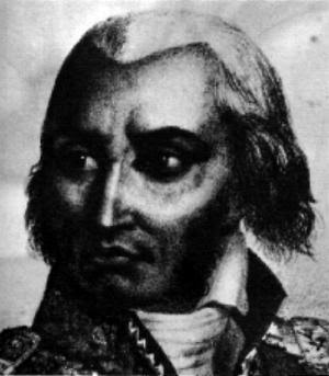


Above:
Gustav II Adolf (also known as Gustaf Adolf the Great).

Historical Notes


Swedish Gustavus II Adolphus; December 9, 1594 – November 6. 1632), widely known by the Latinized name Gustavus Adolphus and referred to by contemporary Protestants as the Lion of the North, was King of Sweden from 1611 until his death. He is the only Swedish king to be styled "the Great". He was born in Stockholm, the son of Charles IX of the Vasa dynasty and Christina of Holstein-Gottorp.
He was King of Sweden from 1611, and as such, he was one of the major participants in the Thirty Years' War. Gustav Adolf was married to the daughter of the elector of Brandenburg-Prussia, Maria Eleonora, and chose the Prussian city of Elbing as the base for his operations in Germany. He died in battle on November 6, 1632 at Lützen in Germany.
During his reign, Gustav Adolf founded the city of Gothenburg as well as a number of smaller cities. He is also the founder of the University of Tartu in Tartu, Estonia, which then belonged to the Kingdom of Sweden. At this time, the three largest cities in the Swedish kingdom were Riga (the capital of Latvia), Stockholm and Tallinn (capital of Estonia). Gustavus Adolphus organized the strongest army of the early seventeenth century, courageously led his forces from the front, and earned the title of the "Father of Modern Warfare" because of his innovative skills in the tactical integration of infantry, cavalry, artillery, and logistics. His advancements in military science made Sweden the dominant Baltic power for the next one hundred years. Future commanders who studied and admired Gustavus included Napoleon I.
As a general, Gustav Adolf is famous for employing mobile artillery on the battlefield, as well as very aggressive tactics, where attack was stressed over defense and mobility emphasized over the usual linear tactics. His musketeers were widely known for their shooting accuracy and reload speed, three times faster than any contemporary rivals. Carl von Clausewitz and Napoleon Bonaparte considered him one of the greatest generals of all time. He was famed for consistency of purpose, and amity with his troops.
The king was an active participant in his battles. He was prone to lead charges himself at crucial moments, and was wounded several times as a result, including gunshot wounds to the neck, throat and the abdomen. Because a musketball was lodged in his neck near the spine and would cause extreme pain if he wore the customary two-part metal shell cuirass, the king adopted a flexible armor of hide. This is what he wore in his final battle. His leather armor is currently on display in the Livrustkammaren at the Royal Palace in Stockholm.
Gustav Adolf occasionally used the name Captain Gars, especially early in his reign, to travel incognito. Gars is derived from the initials of "Gustavus Adolphus Rex Sueciae", Latin for "Gustav Adolf King of Sweden". He was a highly enlightened ruler, and held the Swedish nobility on a firm leash, supporting both the merchant and worker class against the nobility.
Gustav Adolf was killed at the Battle of Lützen, when, at a crucial point in the battle, he became separated from his troops while leading a cavalry charge into a dense smog of mist and gunpowder smoke. After his death, his wife initially kept his body, and later his heart, in her castle for over a year. His remains (including his heart) now rest in Riddarholmskyrkan in Stockholm.


Above:

Battle of Lutzen


Before Gustavus, groups of uncoordinated mercenaries composed most armies, with little overall organization or chain of command. The Lion of the North (as he was known) instituted permanent units, assigned a fixed chain of command, and established a philosophy of cooperation among all combatants. Instead of independent action by many different parts, the entire Swedish army now united to fight as a single team. Gustavus's use of supply lines and bases and his integration of infantry, cavalry, and artillery enabled him to form the first truly professional army in military history.
In February 1633, following the death of the king, the Swedish Riksdag of the Estates decided that his name would be styled Gustav Adolf the Great (or Gustaf Adolf den Store in Swedish). No such honor has been bestowed on any other Swedish monarch since.
The crown of Sweden was inherited in the Vasa family, and from Charles IX's time excluded those Vasa princes who had been traitors or descended from deposed monarchs. Gustav Adolf's younger brother had died years ago, and therefore there were only female heirs left. Maria Eleonora and the king's ministers took over the government on behalf of Gustav Adolf's underage daughter Christina of Sweden on her father's death. He left one other known child, his illegitimate son Gustav, Count of Vasaborg.

The Painting

The Funeral of Gustavus II Adolphus by Mohr is a classic Wimor set consisting of 43 single or group figures of magnificent detail. They are so well engraved that one has to consider if these small jewels would be better unpainted.
They required only some minutes each for clean up and priming to get them ready for painting. Which was a good think for me because I couldn’t wait to start painting them. Each figure received 2 coats of thinned white humbrol paint and set aside for a couple of days to dry totally.
What is important when you painting a set of figures that will be grouped together is first to keep the light source direction constant. I chose a rather common approach of upper left illumination, which it was rather difficult as I found out later because all the figures are presented by their right side and faces are faced to the left. That means that most of the faces are in shadow. What I did for this situation was simply to produce a bit darker mixtures in all flesh tones and create some deep shadows where appropriate, while keeping highlights on the softer side... I tried to highlight upper left sides of all figure a bit more than the lower left sides. Maybe if I should have thought better I would choose an upper right approach for convenience since painting 43 figures isn’t something easy by itself.
Next important thing you have to consider is that since there are many figures with various hues and tones, it would be better if you paint them in small groups of neighboring figures. That simply means that for each 3-4 figures that are close with each other, tones must be kept in harmony so a better aesthetic result will be produced when they are finished and displayed. Hues that “suit” each other such as yellow and brown, or red and green were used for this purpose with shadows mainly produced by their complementary colors respectively.
Another small trick which I strongly advise when doing such a big set is to keep color mixes simple. Every piece of flesh, every cloth they wear, every item they carry, is painted by an individual mix. No two reds are identical, not two blacks are of the same mixture or not two whites are of the same color temperature. Instead, I started from scratch for every color I used for all figures. While you vary your colors, keep the color mixes simple. I personally never use a color that is produced from more than 3 or 4 different hues maximum. If you keep adding colors, end result will be either a mud pool or the actual color will have lost its chroma or temperature somewhere in the process.
I chose to display them in a left to right facing direction with Adolph’s funeral cart and its horses as a central piece and all other figures surround it symmetrically as I though it would produce a nice aesthetic result when they will be finished. I will use black velvet background and after putting each figure on it, measuring distances between lines, rows and individual figures, I will give the whole canvas with figures to a specialist for making the frame. I will chose a simple frame so as not to out power the subject since it is most complex by itself. Name tag will also come from a specialist engraving shop.


Conclusion


Mohr’s set of “The Funeral of Gustavus II Adolphus” is one of the best set of figures I have ever came upon. Attention to detail is stunning even for the tiniest parts. Although is not an easy task to paint all these figures, surely the end result, when they are finished eventually, is most satisfying. I would recommend this set to any collector of flats, especially of this period, but not for beginner painters. Not only the great number of figures, but the small details that most of them have, make it a rather challenging task. Slow and careful painting, good references and lots and lots of time spent and coffee drunk is all that is needed.


The Figures


Above from left to right:

1. Swedish Cavalier.
2. Swedish Aristocrat.
3. Weissenfels Burguomiester.

Above from left to right:

1. King's Life Guard Rgt, Timbalier.
2. Cuirassier Officer.
3. King's Life Guard Rgt, Timbalier.

Above from left to right:

1. Groom.
2. Kettledrummer.
3. Officer, Blu Rgt.


Above from left to right:

1. Duke Bernhard of Sachsen (Second-in-comannd).
2. Germa Life Rgt Usslar, Arquebusier.

Above from left to right:

1. Swedish cavalryman, Arquebusier.
2. Arquebusier Officer.


Above from left to right:

1. Swedish Infranty, Qrquebusier.

2. Swedish Official.

3. Major General Dodo von Innhausen (Third-in-command).


Above from left to right:

1. Swedish Officer.

2. King's Life Guard Rgt, Timbalier.

3. Swedish Officer.


Above:
1. Streiff, the King's horse.


Above:

1 & 2. Horses of the King's cart carrying casket.


Above:

1. The King's casket draped with Swedish flag, escorted by Swedish officers.

Wednesday 11 July 2007

Chapter 12 - The Yellow & Oranges

By Panos Charalampakis
CHAPTER 12
The Yellows & Oranges


Above:
Yet another Franzoia Serge’s masterpiece of the Swedish banner series. Now an example of yellow.


Yellow is the third and last primary color. Added to blue produces green, added to red produces orange. It’s a warm color with purple violet as its complimentary hue. Cadmium yellow series has brilliant, rich chroma while lemon yellow has less chroma, being a little cooler tone. Yellow can be shadowed with orange hues, or brown hues for darker results. But, anything is permitted. Try blue, purple green, anything is possible and no one can say its not correct. If the result is what you re after and it pleases you then why not. I usually use white for highlights or a lighter tone of yellow than the base and using white only for highest highlights. Cadmium yellow replaced. chromium yellow since the latter is poisonous due to zinc content and it has great tinting and covering power making it very useful as for basic painting and for glazes. Remember that its brilliant thought, so if you want to cut its power a bit add small amount of white to decrease its chroma.

Although ochre family doesn’t really belongs here, I will mention about it in this chapter. There are a lot of useful ochres available out there. I like yellow ochre, which contains a bit of black and green even if it’s not obvious, golden ochre and brown ochre. Some people call them earthen yellows. Shading can be done with brows for shadows and napples yellow light or white for highlights. More about these colors in the chapter dealing with replicating metals.

Orange is the result of red and yellow mix. It’s not a difficult color to paint and shade convincely. It has the same properties of the parent colors, so by using opaque parent colors, the orange will be opaque. And same applies for transparent hues. Cadmium orange is the most common hue available. An all time and purpose color. Amber is a light orange also widely used. Orange can be shaded with reds and browns and highlighted with lighter tones of the same color, yellows and white for the maximum highlights.


Above:
An excellent example of yellows and oranges both on same subject painted by Amalia Retuerto.

Tuesday 10 July 2007

Chapter 11 - The Blues & Greens

By Panos Charalampakis


CHAPTER 11
The Blues & Greens


Above:
Another Swedish banner from Franzoia Serge. Nice example of shading turquoise blue.


Blue is a ubiquitous color used from antiquity since present days. A favorite color of ancient Egyptians, Greeks and later abundantly used in medieval and renaissance times. There isn’t anything extraordinary in painting and shading blue hues. Usually a deeper blue can be used for shadows with some burnt umber for shadow variations. It is advisable to shade blues with a lighter shade such as turquoise but titanium white is also used by many painters. Result is somewhat grayish in appearance so its better stick to turquoise or cerulean hue for highlighting. Prussian blue and Winsor blue are 2 very useful colors but be careful when you re using them. They have tremendous tinting power and can overwhelm easily any other colors.


Above:
Far above, Konrad Schulte’s Prussian officer of 1st Dragoon Rgt.. A 54mm own figure.
Above, Peter Ferk’s Lancer trumpeter. A 90mm figure by Quadriconcept.


Use them in small quantities adding just a hint of them in a strepped fashion. Prussian blue is a very opaque color, while Windsor blue is semi transparent. When using it, it is preferable if you undercoat with a similar color in enamels or acrylics . You should know that military blues usually have a greenish shade and they are usually dark with some exceptions, like for example the lancer trumpeter of the photo above. Straight prussian blue or with the addition of some ivory black can be used as the starting color for dark uniforms. Any shade of purple of deep violet could be used for shading, keeping ivory black only for the extreme shadows. Remember, black kills the brightness of colors. Any lighter blue like cerulean blue or some turquoise can be used for highlighting. Don’t use white. Also keep your hand a bit when highlighting otherwise the finished uniform will look faded and worn, except from when you actually are after of this effect. Sometimes I like experiment with napples yellow, or some other similar color for highlighting blue. When done with minor quantities of yellow and slowly, the greenish cast of the highlighted areas look extremely convincing, with the very tips of the highlights with titanium white.
Blue is a classic example of color with cool temperature, so it can be used to tint other colors giving them a cooler appearance. For example, some controlled glazes with very thinned blue hues can give white tunics a cooler, somewhat bluish appearance. Remember also the picture of Detlef Belasch’s bust from the chapter discussing whites.


Above:
Napoleonic Grenadiers, 30mm figures from Berliner Zinnfiguren. Unknown artist. Observe that although nearly all figures wearing full blue clothing, with variation in the mixtures, there is a visual variation in the end result.


Above:
A Swedish banner in 30mm with a green flag with the royal emblem painted by Fanzoia Serge.


Green is not a primary color. It is produced when blue and yellow are mixed. In my mind there are 2 ctaegories of greens. One is the brilliant all purpse greens we use for all eras and the other is the green hues modern military uniforms tend to use as for camouflage. Usually my green mixtures are produced randomly without any specific formula. Have in mind though that if you use transparent blues and yellows then the green will also have the transparent quality, so for basic colring it is advisable to use some more opaque blues and yellows. Try also oranges instead of yellows. The red component in them will produce some quite unsual green hues which by the way have warm tones since red is warming the coolness of the blues.. When I am looking for some modern military green usually I start either from indigo or, and please don’t scream from black. Yellow and black gives olive green tones and adjusting the black or by adding some blues all kinds of green grays can be produced. Shadows can be done with some deep tone of blue, for example Prussian blue or indigo. Try also different shades of red for shadowing. It’s the complementary color of green and its a warm temperature color so it will give warmer shadows too. Highlight with any kind of yellow. Brilliant yellows like cadmium yellow will produce brilliant highlights, while napples yellow or similar will produce toned down highlights. Again, white should be avoided, except in cases we look for worn, faded results.


Above:
A rather unusual flat of some fantastic orce creature. Painter or the origin of flat is unfortunately unknown to me. It’s a good example of olive green with excellent shading not only of green but of all details.

Chapter 10 - The Reds & Purples

By Panos Charalampakis
CHAPTER 10
The Reds & Purples


Above:
An excellent example of reds in this Swedish banner from Franzoia Serge.


In my opinion, red is the most difficult color to shadow and highlight effectively. If not careful shaded parts will be muddy spots and highlights simply another hue i.e. rose or violet. In my mind I have made two categories for reds. Cadmium reds, light and dark and scarlet is the first, while burnt sienna, Indian and light red, that is the earth reds are the second one.
As we travel back through the ages, colors were not of the rich quality as they are now. Reason is because people were using what nature could provide. Reference will dictate a rough estimation of what pigments were available. For sure, red was a color known since antiquity. Greeks and later Romans used it abundantly for their everyday or military clothing.
When painting cadmium reds start with a darker tone than the one you intend to use. You will see why later. When shading, experiment with adding burnt sienna or burnt umber. Alternatively, try the complementary to red, green. You will be amazed by the results. Shade in steps and don’t try to achieve the final result by first layer. I would advice not to use black for shading because it kills the chroma of red. If you try to highlight with white then violet will be produced. If you try yellow, then orange will appear. This is the reason why you need to start your basic mixture darker than the red tone you are after. Light reds such as cadmium red light, scarlet or bright red can be used as highlights. Add tiny amount of light yellow or white for the outmost highlights but do it really sparingly. On the other hand if you are after a faded, worn look, you can use white a bit more freely. Another good highlighting solution is to use your premade flesh color, in steps, adding a touch of yellow to maintain red temperature.


Above and Below:
Above Peter Ferk’s General Lassale (Quadriconcept 90mm), below “Poetry” by unknown artist (Detlef Belasch 120mm). For the first figure highlights are done with yellow while on the second white have been used producing some pink violet highlights.


The actual color of Tyrian purple, the original color purple from which the name purple is derived, is the color of a dye made from a mollusk that, because of its incredible expense (many times more expensive than gold), in classical antiquity became a symbol of royalty because only the very wealthy could afford it. Therefore, Tyrian purple is also called imperial purple. Tyrian purple may have been discovered as early as the time of the Minoan civilization. Alexander the Great (when giving imperial audiences as the emperor of the Macedonian Empire), the emperors of the Seleucid Empire, and the kings of Ptolemaic Egypt wore Tyrian purple. The imperial robes of Roman emperors were Tyrian purple trimmed in metallic gold thread. The badge of office of a Roman Senator was a stripe of Tyrian purple on their white toga. Tyrian purple was continued in use by the emperors of the Eastern Roman Empire until its final collapse in 1453.
In medieval Europe, blue dyes were rare and expensive, so only the most wealthy or the aristocracy could afford to wear them. (The working class wore mainly green and brown.) Because of this (and also because Tyrian purple had gone out of use in western Europe after the collapse of the Western Roman Empire in AD 476), Europeans' idea of purple shifted towards this more bluish purple known as royal purple because of its similarity to the royal blue worn by the aristocracy. This was the shade of purple worn by kings in medieval Europe. Also it is considered a funereal color and for that, can be used alternatively for black.
Purple is an interesting color. It can be produced from mixing blue and red and with various proportions you get various purple tones. It can be shadowed by various blues and highlighted by its complementary yellow for some rich violets or white for some faded look. Alizarin crimson belongs to the purple family and not to the reds as many time mistakenly considered. Crimson mixed with blues produces some very interesting shades of purple. I would advice shading it with black as it kills chroma making purple appearing muddy. Some purples are more transparent than others so experiment and use the more opaques for covering work and the transparent for making purple washes when a tint of purplish is needed.


Above:
An excellent painting of purples for the dresses of this French queen and for the embroidery by unfortunately by an unknown painter.

Monday 9 July 2007

Chapter 9 - The Dreadful Black & White

By Panos Charalampakis
CHAPTER 9
The Dreadful Black & White


Above:
Swedish banner painted by Franzoia Serge. Observe the excellent black and white checked pattern of the flag.


For the next five chapters I will deal with various colors grouped in categories. Let me say it from the start. I am not a professional artist nor I have finished any art school. What will be presented here coming from personal observation, experiences and notions. Feel free to agree or disagree with it, accept the tips and use them for your painting or don’t accept them, make your own observations and go from there. For example someone can say, hey don’t shadow red by using alizarin crimson. Why not? If the shadowing made by it pleases me then by all means I will use it. I have shadowed red with darker red, brown, green, crimson, even blue. And I ask again, why not? In the end, we are amateur painters that like to experiment and try new things and if the end result is what we were looking for, then we are allowed to use whatever irrespective of rules.
Before we begin discussing about the various colors lets clear some words using the following table.


Hue
The specific character of a colour, e.g. an orange-red or a green-blue, its position on the colour wheel.
Value
How dark or light a colour is, from 0 to 10, black to white. Cadmium Red Medium is typically about value 5.
Chroma
How intense (bright or dull) a colour is, for example Cobalt Blue is high in chroma, Chromium Oxide Green is low in chroma.
Primary
A colour that cannot be mixed from other colours, e.g. red, yellow and blue.
Secondary
A colour mixed from two primaries, e.g. orange, green and violet.
Complement
The colour opposite to another on the colour wheel, e.g. red and green, yellow and violet, blue and orange.
Subdue
To dull down, to lower the chroma of a colour, usually by adding its complement.
Bias
The leaning of a colour towards another, e.g. a green-yellow or an orange-yellow.


Let’s start with black. When you want something painted in black color, simply don’t use black. Instead either mix some blue with ivory black for a cooler shade or flesh for a warmer shade. Adding some brown, red, violet or green will tint the black color slightly giving our blacks a greater variety. Add some titanium white to lighten the black a bit. In reality you will have made a gray but in our eyes still be black. Now add shadows with pure black, lamp black preferred and highlight with turquoise or flesh depending on if you want cool or warm temperature and minor quantities of white. Don’t exaggerate the highlights though. Blend as well as you can for subtle transitions between shadows and lights. Look at different painted figures and you will notice after careful observation that no straight black is used anywhere. Instead different shades of dark gray, with the appropriate shadows and lights create the effect of a black surface even if its not. Otherwise if you start straight with black, there won’t be any color for shadows. Ivory black is a color that can be used to darken other colors without overwhelming them.


Above:
Composite figure from Mohr’s set “Funeral of Gustavous Adolfus” painted by Greg Di Franco. Lots of black clothing but nothing too difficult if you don’t start with straight black.


Same story is white color but from the opposite side. If you start with pure white, there won’t be any color for the highlights. Instead make different combinations of white adding nearly any color you like. Ochres and browns will create a tan-white, warm in color shadowed with more brown and highlighted with straight white. Red, green, purple or blue can be used for spectacular variety for your whites. Blue and green will give a cool temperature to your white. What is very challenging to make and interesting to observe after, is when different shades of white or black are side by side like a figure wearing a white tunic, with a white sash and white trousers.


Above:
A bust of an unknown artist from a Detlef Belasch creation. Observe the cold temperature of the white shirt. Instead of gray black boring shadows, some shade of blue has been used.


If you make 3 different mixes of white with 3 different hues added, your end result will have all 3 surfaces white but each will look different from the other. Titanium white is the most used white, opaque all purpose white that you will use it in nearly every color mixture you make. Flake white is a transparent white, useful for white glazes. Zinc white is rather rare lately because of its zinc component which is poisonous.


Above:
An amazingly painted Napoleon in coronation robes by Greg Di Franco. Here shades of ochre have been used for shadowing, Compare with previous photo. Also observe how direction light is implicated by the careful painting.


As with every other color, use the amount of shadows and highlights you feel happy with them. Don’t consider that a black item has less and a white has more. They can have as many as we want them to have. Just be patient when you paint and don’t rush for finish.
Black and white will be also discussed in the chapter about painting metals since they can be used to implicate a metal surface by careful shadows and lights. Although I don’t own any gray oil tubes, only exception is Payne’s gray. It’s a dark gray, rather transparent color than can be used as a shortcut when we need a gray fast and it’s perfect for white metal simulation but more about this later.

Saturday 7 July 2007

Chapter 8 - Painting Flesh

By Panos Charalampakis


CHAPTER 8
Painting Flesh


Above:
“Diagonal of Dreams”.
A Vladimir Nuzhdin figure based on a Luis Rojo painting masterfully painted by Catherine Cesario.


We start our specific color discussion with Flesh. Actually, flesh is not a specific color itself. We use it to describe a number of colors that human skin can be painted with. It varies not only between races like for example Caucasian and Asians but also among people of the same race. Theoretically not a single person have exactly the same skin color with another.
Flesh skin color varies with race, with geographical location, with the person’s own occupation, with his/her present medical condition and also in different parts on the same body. First difference is easy to understand. A Caucasian has a more “pinkish” skin color than an Asian inhabitant, whom faulty consider as “yellowish”. Geographical location plays important role as we all can understand the skin difference between a Northern European Swedish lady and a Southern European Greek lady. Occupation plays its role too since someone who is outdoors most of his life (i.e. soldier) have a much different skin color than an aristocratic lady spent most of her life into a palace. Also, the face of a man that likes to drink a bit more, like some Napoleonic veterans has different color than from someone who is outdoors in Russian winter, barely surviving the cold. Finally, we all can see the color differences onto our own body. Our palms and soles don’t have the same color as the rest of our body. Or better yet, we all have laughed with the color difference between what is covered and what is not after two hours of sunbathing. What is very useful for us, is to always observe people around . See how their body is “painted” by nature, observe how skin tones change with occupation or by different sun exposure. Observe all these minor details such as the small reddening of the chicks, or the bluish hue below tired eyes. I have said that photographs of figures are very important and useful for us. Here we need not only photos from figures but photos from real people that can be used as reference to help us achieve the skin tone we are after.


Above:

A marvelous 90mm Quadriconcept figure of a French Trumpeter by an unidentified artist.


Let’s start from the “easiest” race to replicate in miniatures, the Caucasian race. This is the traditional flesh tone that we encounter from our very first figure, flat or round. Basically it’s a mixture of ochres and reds, shadowed with deeper reds or even browns for the extreme shadows such as hairlines and highlighted with lighter ochres or even white for hot spots. All colors of this chapter are W & N unless otherwise stated. What I use for Caucasian flesh tones are the following: yellow ochre, golden ochre (Van Gough), brown ochre (Van Gough), burnt sienna, indian red, light red, burnt umber, vandyke brown, titanium white, napples yellow and jaune brilliant. I won’t mention ratios. I strongly believe that for a successful rendering of human flesh one should experiment and test different mixtures of the above colors and in different quantities. Just test the final combination onto your own skin of the back of your hand (not palm!) and see how it goes from there. Also check your photographic reference for endless possibilities. This way, you get to know colors and certain tones and you understand how different hues are obtained. In the end every figure will be a tad different from the previous ones, even if it’s not easily noticeable.
After you primer a figure is a matter of choice if you will block the basic colors with an undercoat. Sometimes I do it sometimes I don’t. Depends on the scale, the mood, the general feeling of the face you want to paint. If you block the flesh color go after a similar tone of your base oil color either in acrylics or enamels. After this step apply the basic tone in all flesh areas but do it in parts. First finish the face, and then proceed to the hands, body, feet etc. Start with some mild shadows with the addition of the reds in your basic mixture like burnt sienna or light red. Face shadows should go under the chicks, the eyes, the sides of the nose, bridge of the nose, the mouth, ears, temples, sides of the mouth. Don’t worry about neatness at the moment. Blend with a dry, brush with the base color. Now add the first highlights adding some jaune brilliant and titanium white to the edge and tip of the nose, upper portion of chicks, forehead, chin, earlobes. Blend again but be careful not to touch the shadowed areas. By now, face has started to take a human appearance. Now its time to let the colors settle and dry and you to go get a refreshment. When this primary coating is dry, usually next day, make darker and lighter mixtures of the shadow and highlight colors respectively and touch again the appropriate areas. They are about the same as previous ones but a bit narrower in each spot. You can do this as many times as you feel like. Personally and for 30mm figures, I find it more than enough to stop right here. Remember to use an extremely dark shadow and outline eyes, nose, lips and details of the ears, if they are any visible at all at this scale. Also put some “hot spots”, nearly pure titanium white in very selective, most light caching part of a face i.e. tip of the nose, upper chicks, chin. Now is time to define and work on eyes, lips, eyebrows moustaches, beards and hair. For 30mm, usually a dark spot or a dark line, depending on the position of the face is all that is needed. For larger scale figures you can choose any eye color you like but use dark tones of each selected color since lighter colors don’t seem realistic. Highlight lower portion of the iris and add a black dot in the middle for pupil. Adding a catchlight, that is a white spot a bit of center adds realism. Lips can be painted with the basic flesh color with some alizarin crimson added and lower lip highlighted.
Now hair is another story. Don’t rush painting the hair as something of no importance. As a frame of a picture can influence the actual picture, hair can add or not to the beauty of a painted face. Decide if their hair will be black, brown, blond, gray ore even white. Black hair are never pure black, Go for a very dark brown black or blue black color. Brown hair is from deep brown until nearly blond and for the love of god, blond hair are not yellow! Instead use some ochres or raw sienna. Depending on scale, hair detail can be added but don’t try to paint every single hair. It’s not possible. Instead shadow and highlight tufts of hair. Looks much more convincing. When face is finally finished, be brave, make a very thinned mixture from the base color with some lamb black added, and apply it to all areas that need shaving much like a wash. This is the so called “5 o’clock” shadow.


Above:

An interesting Golberg set title “The Slave market” superbly painted by the British Ken Pipes.


Hands and feet are also very important. Viewers eye always focus on these two parts after the face. Deal with them accordingly. Shadow the areas between fingers and knuckles and highlight the knuckles or the parts towards the light source. If scale permits we can even add nails with a lighter whitish ochre color, not pure white or add some basic veins with a bluish color very thinly and lightly painted. If other parts of the body are exposed, study some real life photos and treat each musculature group as a whole when shadowing and highlighting. Remember that auxillas, groins, popliteal fossae, navel and intercostals spaces are a bit darker. If you paint a nude, add body hair with thinned dark gray or black but do it very sparingly or else your figure will look like a Neanderthal fellow.
Now, how we can produce the difference of rational variability in the Caucasian race? Easy. By altering our base mixture and by changing the amount of shadowing and highlighting. People of the Southern regions tend to be more tanned due to increased sun exposure much like a veteran soldier on campaign is more tanned than a gentleman of French aristocracy of the Louis XV era. Adjusting the reds and ochres in our mixtures and making sharper contrast between shadows and highlights can produce a tanned appearance. People of Northern Europe, the traditional “blonds”, have a paler skin that even when exposed to sunlight becomes reddish rather than dark tan. A touch of cadmium red or even violet to our mixture will give a “pinkish appearance, much needed for such a skin tone.
As a side note, don’t forget the tonal differences between a woman’s and a man’s skin. Women tend to have a lighter toned skin, due to less melanin pigments in their skin and also due to a more even hair growth. Simply adjust your mixture a bit lighter than usual and try it onto a female figure. Don’t forget what we have said over and over. Observe nature around you, study photos of real people and painted figure and experiment, experiment and experiment.


Above:
Excellent skin rendition in this Mohr’s 54mm set for Holy Inquisition by the Italian master Gianfranco Speranza. Observe the hair growth of the tormentor on the left.


A bit more difficult matter is the successful rendition of the widely and wrongly called “Black” people. First let’s clear something. There is no black, white, red or yellow people. Clearing this, the notion “black” includes a wide number of different ethnicities. Even in the same geographical region, for example Africa, not all Africans have the same skin tone. Their skin ranges from nearly very dark Caucasian to very dark brown, even to the point that might be called black, but again, its not.
Some painters start this type of skin straight onto the white primer. They paint their base color, usually a burnt umber or something close and then dry brush the whole skin area leaving only a thin film of base color. Highlights have been produced by dry brushing so what is left is to shadow a bit with black, retouch their highlights here and there and voila. I prefer start with a Caucasian flesh painted onto the primer. I paint my blacks with various combinations of burnt umber with indian red, ran umber, raw sienna, or ivory black. After taking away all of the excess paint, some flesh tint of the underlying flesh color is visible but not much pronounced as if it was straight onto white primer. I proceed with highlights using raw sienna, ochres and on very few selected spots some touches of titanium white. Shadows are done with the base mixture plus lamp black, sometimes with very tiny amounts of Prussian blue or Venetian red. As I have told before I try to vary my mixtures so I never have a same color, even if its not visible. I know its true so I am happy anyway.


Above:

“Zulus”, a nice set of figures from Paul Krog of Ritter Zinnfiguren.


A good trick is to paint the base coat green and start from there. The end result will be a unique negroid color. I use this method when I want to paint Zulu type ethnicities. On the other hand Nubians are very dark chocolate to nearly black so make a deeper than usual mixture and add a tiny amount or blue. When highlight them with small amounts of titanium white, highlights will have a light bluish appearance which is truly marvelous for these people. Northern Africans, are a bit lighter, while Egyptians, especially of the northern part of Egypt are not negroid but they seem like very tanned Caucasians. and African Americans can have the whole range of tones. Hair color is black and eyes are always dark in color, that is brown. Photographs of the actual people to be our “models” will do the trick and help you decide which “black” you must paint.


Above:
“Tribute to Pharaoh”. Figures from a magnificent set by Cortum figures painted by Ken Pipes.


Asians is a huge category including nearly all type of human skin tones. As we move away from Mediterranean, tones become darker and darker until the middle east and India. Colors vary from light to very dark tans and browns. Mixture should contain higher amounts of various ochres tones, with less reds in it. Shadows can be done with different browns like burnt umber or Vandyke brown and highlights with light ochres, napples yellow and titanium white. Chinese and Japanese, the traditionally called “yellow” are not yellow of course. The predominant color is various shades of ochres but they don’t differ much from Caucasians in reality. I usually add some touches of jaune brilliant or napples yellow to the basic mixture but I do use brownish reds for shading. Again , hair is nearly always black with dark eyes. I like painting this kind of hair blue black actually adding some Prussian blue to my black mixture. When highlighted have a pleasant bluish appearance making hair very shiny.
Native Americans, the so called Indians or “red skins” are another major category of peculiar color to render convincebly. Sometimes I leave my figure just with the primer, sometimes I use the flesh color as a blocking color. I usually add a bit of more burnt sienna, or indian red, or light red. Shadows are done with reddish browns and highlights with titanium white, sparingly.


Above:

Amalia Retuerto’s Indian. Her figures are simply a joy to see and a lesson to study.


Adding some skin marks can be fun and very rewarding for the finished figure. Scars, moles, freckles or veins all can be reproduced easily with just a bit of color. A reddish brown line with a lighter shade above it can look like a scar while a bluish line fading proximally and distally can represents vein very convincible. Use your references and when you are painting personalities check if that person had any skin mark. They add variety to your flesh painting and personalize the finished figure.
A final word about tattoos. In reality tattoos are made by colors injected with specific hypodermic needles under the skin, coloring it. Predominant color is blue gray but red, green and yellow are used sometimes for more exotic designs. Stick to the blue gray ones for your figures. Colored ones don’t look realistic. Use very thinned paint and very thin brushes. Don’t try very elaborate designs. A little goes a long way.


Above:
Another example of exotic skin painted by Amalia Retuerto.

Wednesday 4 July 2007

Chapter 7 - Artist's Oils

By Panos Charalampakis
CHAPTER 7
Artist’s Oils


Above:
Another masterpiece of the French painter Serge Franzoia. An excellent painted background with equally good painted figures. Observe how careful selection of vibrant colors can make the theme so eye-pleasing.


For many flat figure painters, myself included, artist oils is the preferred painting medium. They are a versatile painting medium mainly because they have a slow drying time that enables to paint and blend colors and to create shadows and lights quite easily and with no rush. Also mistakes can be corrected easy enough, since you can simply wipe the paint of the figure and reapply it again.
When painting with oils, always try to have a selection of various colors of the best quality you can afford. Personally I am using W & N artist series with an assortment of some specific colors from other brands. Below is a list of the tubes I consider as basic and from which all other colors can be prepared.


  • Ivory Black
  • Titanium White
  • Burnt Umber
  • Raw Umber
  • Burnt Sienna
  • Raw Sienna
  • Yellow Ochre
  • Prussian Blue
  • Cobalt Blue
  • Cadmium Red
  • Cadmium Yellow
  • Magenta


Theoretically by combining these basic colors someone can produce literary any color or any hue available. A great help can be a color wheel which shows what happens when two colors combine. Remember also what we said in the chapter about general thoughts of paint about complementary colors.


Above:
Some basic knowledge of the color wheel and some good use of it can produce virtually any coloring possibility available.


In reality, we all have more colors than the few basic ones. More reds, blues, yellows and of course purples and greens. I haven’t mentioned metallic paints at all. Partly because I will discuss about them in a later chapter and partly because I prefer using grays and yellows for replicating metal. More about this later on.
Whatever oil colors we have in our disposal is useful to know their properties, how they behave alone or in combination with other colors. Some are opaque, some are transparent so their coverage degree is not the same. While we can use an opaque color alone or combined with some other for basic coverage of a surface, we can use a transparent one, thinned as a glaze to change the tone of another surface. For example we can warm up a white tunic by a careful application of a yellow transparent glaze in one or two coats. Some are very strong like for example Prussian blue. Use them sparingly. When pigment comes out of the tube usually come along with the oil they are mixed with. Put a small quantity of the color you want to work with on your palette, (anything can work as a palette, I usually use a glass with rounded edges covered with an absorptive white paper), let it settle for a moment and then add, with the tip of the brush, some white spirit and mix thoroughly. Consistency of the oil should be like “ warm butter” as Shep Paine says. Apply it on the figure and then take the excess oil with a dry brush. Leave only a thin layer of oil color onto the figure. Now we are ready to add our shadows and highlights with some darker and lighter tones that we have either premade or we can do it straight onto our figure using a lighter or darker tone of the same color. Avoid white or black for this job. Although they are neutral colors they tend to alter our primary color. Careful blending of the edges with a dry brush is imperative so we won’t end with a sea of mud onto our figure. When figure is completely dried we can come back and enhance some shadow or highlight areas some more until we are satisfied with the result.


Above:
Hittite Chariot painted by Konrad Schulte.


Usually oils dry after 24 hours or more and they are completely dry after some days. There is a shortcut though. If we place our figure under a light, in a reasonable distance from it, or into a specific for this job made oven , oils not only can get dry in a couple of hours but they loose their seen, a property that we are after when we paint material like woolen or linen cloth. Animals furs, especially live horses and leather have a natural seen, that oils produce with much success and without a particular effort. If we want this slight seen then we simply don’t “bake” them. Some people prefer matt finishes, some other a slight seen, an “egg shell” finish as they call it and still some prefer a glossy appearance. This is a matter of personal preference. Personally, I am going for a realistic finish. Some materials are mat, some have a seen. This is what I am after.


Above:
“Snail Mail” figures from Detlef Belaschk painted by Jerry Mortimore.


If you use the advantages and disadvantages of each color and manipulate them with some common knowledge and according our experience we can produce some very spectacular results quite easily. Well, as easily as a 30mm face, sleeve or boot permits…I want to stress out how important is the smooth, even covering onto the figure. If paint doesn’t “sit” onto the figure smoothly, since we are working in tiny areas of 30mm, even the slight imperfection will be visible to our finished figure. Always make sure, the color has the proper consistency before apply it onto the figure. Test it onto a scrap figure. Apply more than one coat if necessary and don’t rush it trying to finish a figure in 1 hour. Its neither a competition nor a race. We do it for the pleasure of the creation and of collecting flat figures. I know how difficult is not to rush finishing a figure. I am very anxious to see the finished result in every figure I paint but we need to resist the urge to finish it fast and work slowly and carefully for the best possible results.
Observing carefully the selection of the accompanying photographs and putting what we have discussed so far on them, you can more readily understand how things work practically onto a figure.


Above:
Burgundian Romance by Scholtz (edited by Fritz Menz) painted by the very talented artist Catherine Cesario


For specific properties and techniques for each color and for replicating flesh or specific materials like leather, metal, silk and others, a more detailed discussion will follow in the next chapters.